Preview image. Unlock full-res
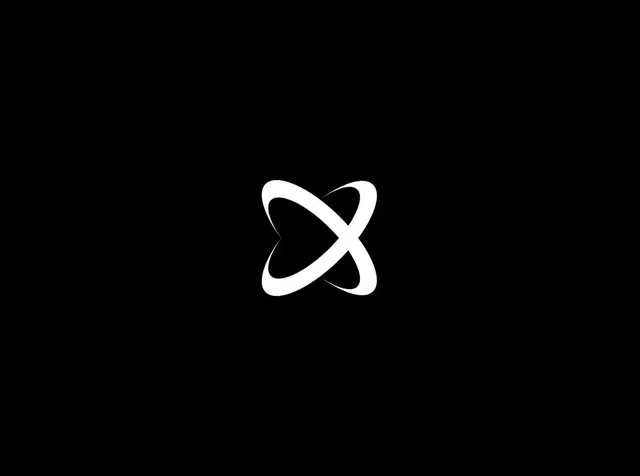
A space-inspired redesign concept for the X logo, merging the letter form with orbital rings to evoke Earth and community, shown in isolation and mocked up as an iPhone app icon.
More like this
See all
Summary
A space-inspired redesign concept for the X logo, merging the letter form with orbital rings to evoke Earth and community, shown in isolation and mocked up as an iPhone app icon.
Visual description
A white X mark composed of two interlocking curved rings, centered on a black background. The rings orbit around each other with organic, flowing strokes that suggest motion and spatial depth. The form balances geometric precision with subtle curvature, creating a modern mark that reads as both a letter and an abstract orbital system.
Key takeaway
Use interlocking orbital curves to merge a letter form with circular geometry, creating marks that feel both precise and dynamic.
Reuse notes
Reach for this as a identity system reference. Pairs with geometric, minimal directions. Original by Ruben Hume.
More like this


Keep what you find
A free account saves references to boards and can send you a weekly email of picks based on what you save.
To see every result, go Pro.