Preview image. Unlock full-res
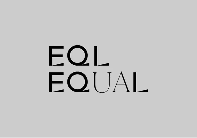
Two stacked lines of geometric sans-serif type reading 'EOL' and 'EQUAL' with thin letter spacing on a neutral gray background.
Summary
Two lines of geometric sans-serif type stacked vertically, spelling "EOL" and "EQUAL" with precise letter spacing on a neutral gray background.
Visual description
A stacked identity using a modern geometric sans-serif typeface. The first line reads "EOL" in bold, uppercase letters; the second line reads "EQUAL" in the same font weight and color. The letters are spaced with intentional rhythm, maintaining visual alignment. The type is set in pure black against a medium neutral gray background. The composition is left-aligned with ample negative space surrounding the text. The typeface has clean, uniform strokes with no serifs or flourishes, emphasizing geometric precision and contemporary minimalism.
Key takeaway
The stacked arrangement creates visual interest from pure typography without additional graphic elements. The consistent font weight and geometric letterforms convey stability and clarity. The careful letter spacing prevents the narrow letters from appearing cramped, demonstrating thoughtful typographic spacing. The stark black-on-gray palette allows the forms themselves to communicate rather than relying on color.
Reuse notes
Excellent for corporate or nonprofit identities requiring clarity and directness. The monochrome treatment works in print, digital, and single-color applications. The geometric quality reads as contemporary and trustworthy. Works well scaled to various sizes due to the clean letterforms. Pair with generous margins and minimal additional elements to maintain the identity's strength.
More like this





Keep what you find
A free account saves references to boards and can send you a weekly email of picks based on what you save.
To see every result, go Pro.