Preview image. Unlock full-res
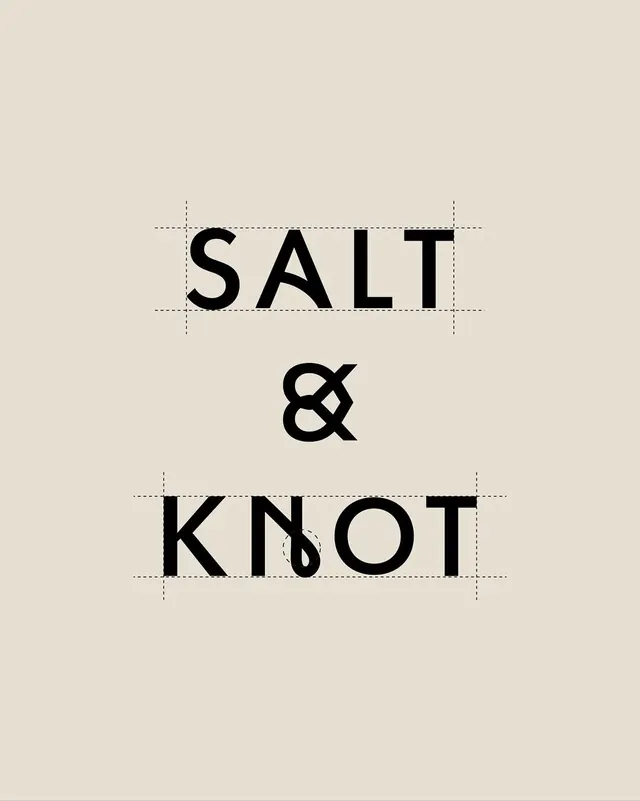
Minimal typographic lockup pairing SALT and KNOT in heavy sans-serif with a centered ampersand, all outlined with construction guides on warm beige.
Summary
Minimal typographic lockup pairing SALT and KNOT in heavy sans-serif with a centered ampersand, all outlined with construction guides on warm beige.
Visual description
Black sans-serif caps in a stacked arrangement against warm off-white (cream) background. SALT sits above a centered ampersand, KNOT below. Each word is surrounded by construction lines (dashed rules) showing the bounding box and baseline guides used in layout. The ampersand is noticeably serif-influenced with bracketed serifs, creating subtle visual contrast against the geometric sans. Generous negative space between lines. The composition is vertically centered and symmetrical.
Key takeaway
The measured use of construction guides visible in the final composition, suggesting intentionality and craft. The serif-sans hybrid feeling via the ampersand adds warmth to an otherwise austere arrangement. The stacked layout with centered divider is immediately readable and memorable.
Reuse notes
Excellent type-system reference for brands seeking structured, editorial sophistication. The construction guides work as a documentation technique, less so as a production finish. Beige + black is a timeless, premium pairing; can be adapted to other color grounds. Serif ampersand detail rewards close inspection at print scales.
More like this





Keep what you find
A free account saves references to boards and can send you a weekly email of picks based on what you save.
To see every result, go Pro.