Preview image. Unlock full-res
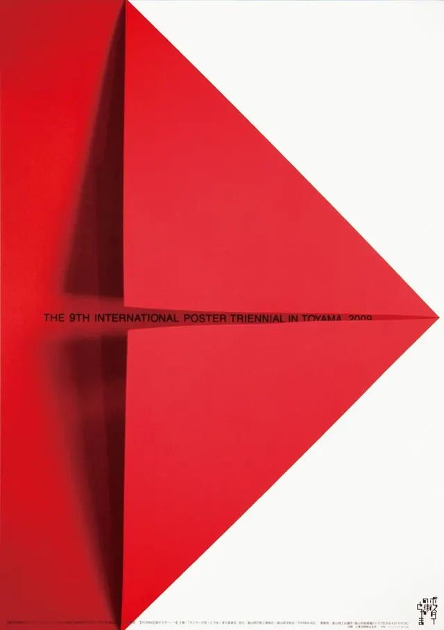
Poster built on a single bold red arrow-diamond form with shadow depth, using extreme geometry and monochromatic color to announce a design exhibition.
Summary
A poster leveraging a single massive red arrow-diamond form with dimensional shadow to create a bold, directional focal point that announces an international design exhibition with minimal typographic support.
Visual description
Large rectangular poster divided diagonally. The dominant element is a geometric arrow or diamond shape in bright red (#E4313D) that points rightward and downward, occupying roughly 60% of the composition. A darker red shadow (#580E11) lies directly behind and below the arrow, creating a strong illusion of depth and movement. The upper left and right margins are reserved white or light grey; the lower section contains small justified Japanese typography in black, anchoring the event information without competing with the red form. The geometric simplicity is extreme: one shape, one accent color, one direction.
Key takeaway
The use of a single, massive geometric form as the primary communicator, allowing typography and supporting elements to recede entirely; the dimensional shadow technique that adds depth and sophistication to an otherwise flat, minimal composition; and the directional vector (the arrow) that creates visual momentum without ornament. The dramatic scale of the red against white forces hierarchy through geometry alone.
Reuse notes
Exceptionally strong for exhibition, conference, or cultural posters where a single, clear visual metaphor can drive attention. The approach works best when the geometric form itself carries cultural or contextual meaning (here, the arrow suggests progress, direction, or the flow of innovation). The color choice of a warm red ensures high impact in both digital and print contexts. The extreme minimalism demands excellent typography placement in the reserved space and works best on large formats where the geometric impact can breathe.
More like this



Keep what you find
A free account saves references to boards and can send you a weekly email of picks based on what you save.
To see every result, go Pro.