Preview image. Unlock full-res
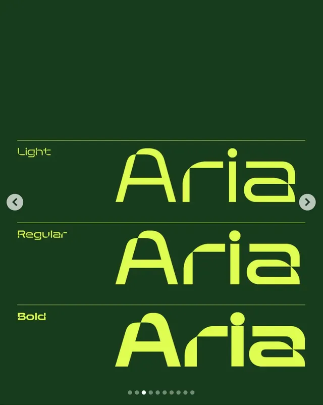
A vertical type specimen for Aria, a geometric sans-serif, showing Light, Regular, and Bold weights in bright lime against deep forest green.
Summary
A type specimen for Aria, a geometric sans-serif, displayed in three weights (Light, Regular, Bold) in neon lime against forest green, with navigation and pagination controls.
Visual description
The composition arranges three font weights vertically in stacked rows. Each row pairs a left-aligned label (Light, Regular, Bold) with the word "Aria" centered in that weight, rendered in bright lime (#DFFD52) against a dark forest green background. Horizontal rules above and below each sample create visual separation. Navigation arrows flank the sides, and circular pagination dots anchor the bottom. The typeface shows consistent geometric proportions across weights, with open letterforms and uniform stroke relationships typical of tech-forward geometric design.
Key takeaway
The stark lime-on-green contrast creates maximum legibility and visual punch without color complexity. The minimal supporting elements (rules, arrows, dots) establish a clear interface hierarchy for browsing. The weight progression demonstrates typeface versatility in a compact, scannable format.
Reuse notes
Strong reference for designing type-specimen posters or interactive font showcases. Works for tech, design, or creative brands seeking a bold, contemporary look. The color contrast is high-impact but best paired with neutral contexts elsewhere in the design; the vivid palette risks competition if repeated across multiple elements.
More like this
Keep what you find
A free account saves references to boards and can send you a weekly email of picks based on what you save.
To see every result, go Pro.