Preview image. Unlock full-res
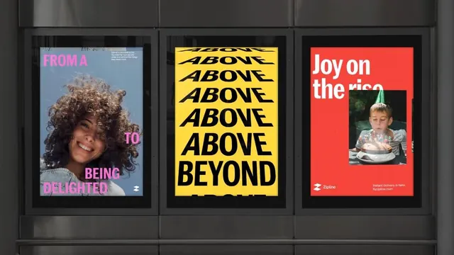
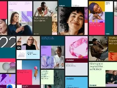
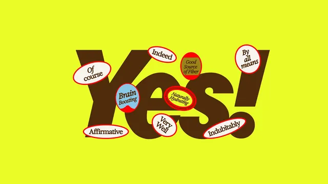
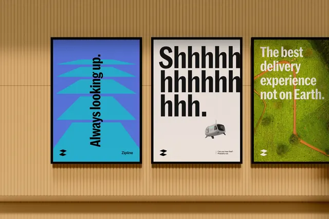
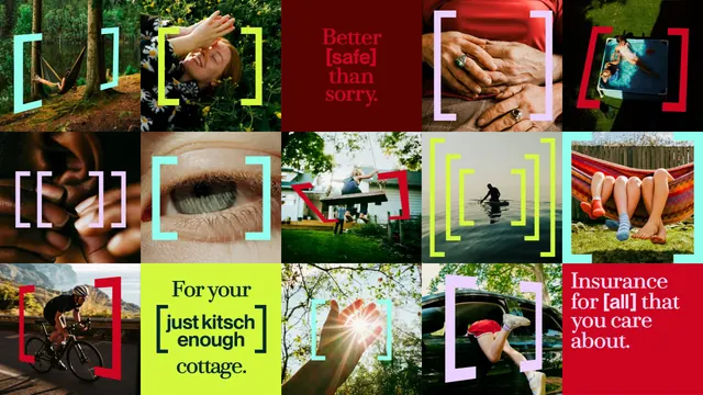
5x3 image grid mixing photography and graphics with thick colored frame accents, combining editorial tone-of-voice with lifestyle and product imagery.
Summary
A 5x3 grid of varied brand imagery framed with thick rectangular accents in bright yellow, white, cyan, and dark red, overlaid with bold brand messaging on select cells.
Visual description
A curated grid layout combining nature photography, close-up lifestyle shots, architectural imagery, and abstract compositions. Each cell is surrounded by a thick rectangular frame in one of four colors: bright lime-yellow, white, cyan, or dark red. The colored frames overlap and contain the images, creating visual rhythm across the black background. Select frames contain brand copy: "Better is faster than sorry" in red text on dark background; "For your [just kitsch] enough cottage" in black text on bright yellow; "Insurance for [all] that you care about" in white text on red. The photography ranges from landscape vegetation, close-up hands, a piano interior, to cyclists and feet imagery, creating visual variety and tactile warmth.
Key takeaway
Thick rectangular frames act as both design accent and text container, unifying disparate imagery through color discipline. The mix of photography and graphic overlays creates compelling editorial narrative while maintaining brand consistency. Strategic copywriting on only three frames prevents visual chaos while emphasizing brand voice.
Reuse notes
Powerful for brands seeking to communicate lifestyle and values beyond product shots. The colored frames system scales across campaigns and platforms. Works well for insurance, consumer goods, or lifestyle brands needing to balance professional tone with human warmth and relatability.