Preview image. Unlock full-res
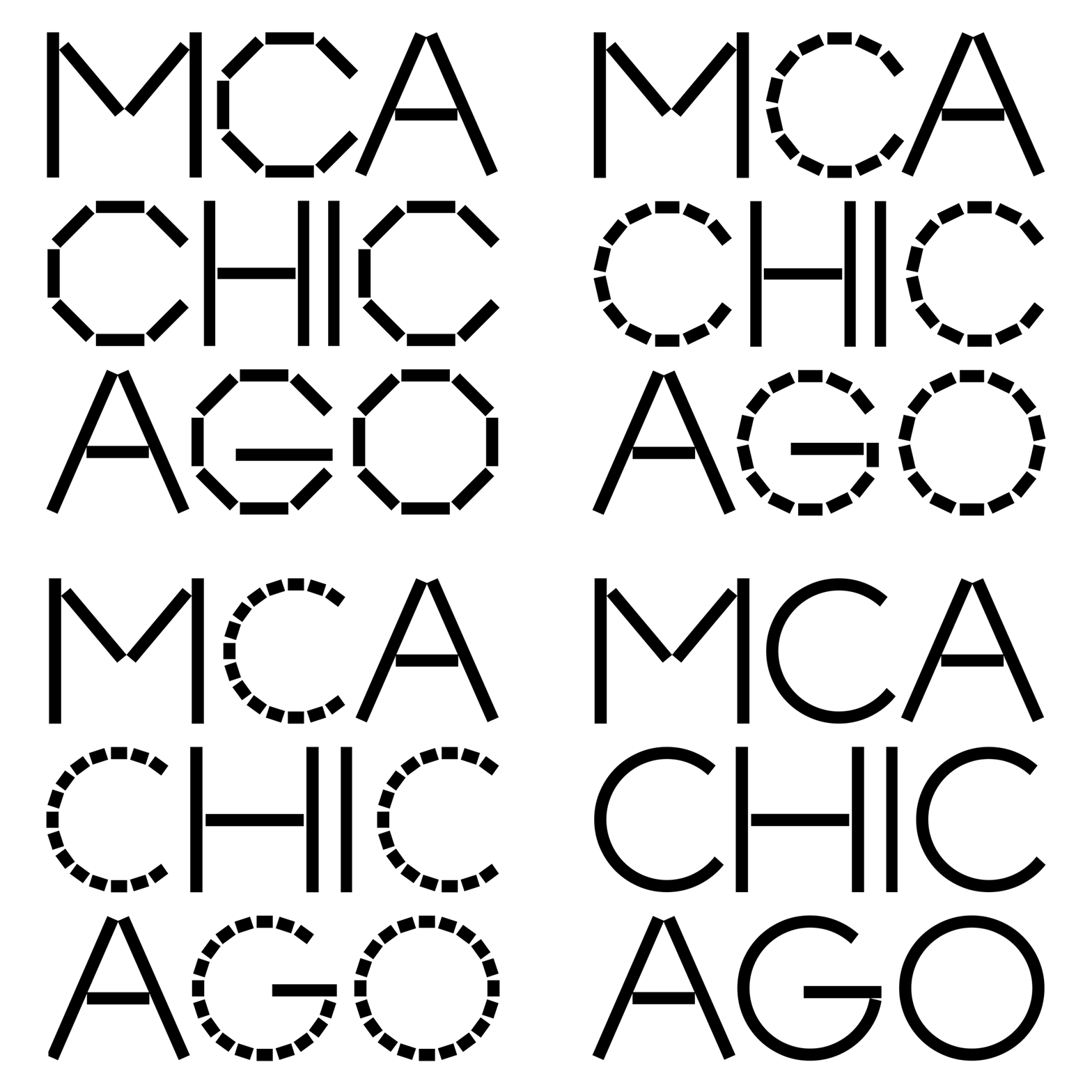
A typographic system spelling six brand terms using only angular line segments and geometric shapes, constructed on a strict modular grid.
Summary
A typographic system spelling six brand terms using only angular line segments and geometric shapes, constructed on a strict modular grid.
Visual description
Six words arranged in a centered three-row grid, each composed entirely from uniform-weight black line segments and geometric shapes (rectangles, triangles, circles, hexagons) aligned to an invisible modular system. Every character is constructed from discontinuous strokes and shapes rather than traditional letterforms, creating a high-contrast technical aesthetic against a white background. The monoline stroke weight remains consistent throughout, with no curves or serifs, emphasizing the purely geometric construction method. The layout is perfectly symmetrical and centered, with even spacing between words.
Key takeaway
The constraint of using only angular segments and basic shapes to spell legible text, and the visual discipline of aligning everything to a strict grid system that makes the logo feel systematic and replicable. The monoline stroke weight throughout creates perfect technical clarity without hierarchy or variation.
Reuse notes
Strong choice for brands in technology, architecture, or structured systems design where the methodology and rigor matter as much as the mark itself. Works well as a display typeface, signet, or architectural guideline specification. The geometric construction makes it scale confidently from very small to very large.