Preview image. Unlock full-res
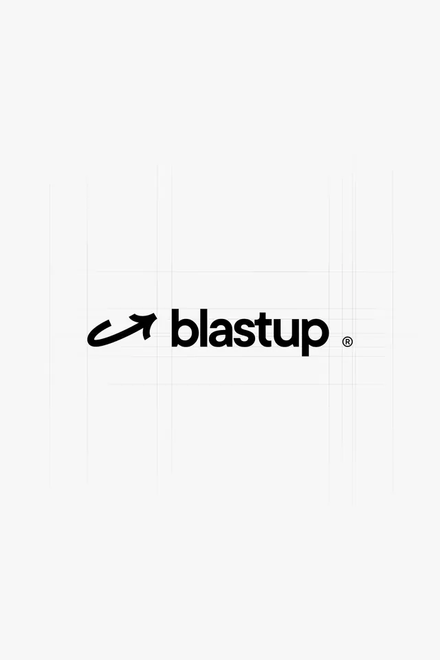
Monochrome wordmark for Blastup pairing a curved upward arrow symbol with bold geometric sans-serif type, communicating upward trajectory and momentum.
Summary
Clean monochrome wordmark combining a curved upward arrow icon with bold geometric sans-serif type to convey forward momentum and growth.
Visual description
Centered on a white background, the Blastup logo consists of a custom upward-arcing arrow symbol followed by the word "blastup" in a heavy, geometric sans-serif typeface. The arrow curves from lower left to upper right with a smooth, ascending motion, while the type sits at the same baseline, creating visual unity between mark and word. A small registered trademark symbol sits to the right of the final letter. The composition is balanced and horizontal, relying entirely on weight contrast and form rather than color.
Key takeaway
Icon-to-wordmark integration: the arrow curves naturally into the type's opening, making the mark and word feel like one unified system rather than icon placed next to text. The heavy sans-serif weight gives confidence and tech credibility. The upward arrow direction is subtle but reinforces brand intent without being decorative.
Reuse notes
Strong fit for startups, growth-focused companies, and developer tools. The monochrome treatment is versatile across contexts but the heavy geometric feel skews tech and corporate rather than playful. Best paired with minimal secondary colors or neutral palettes.