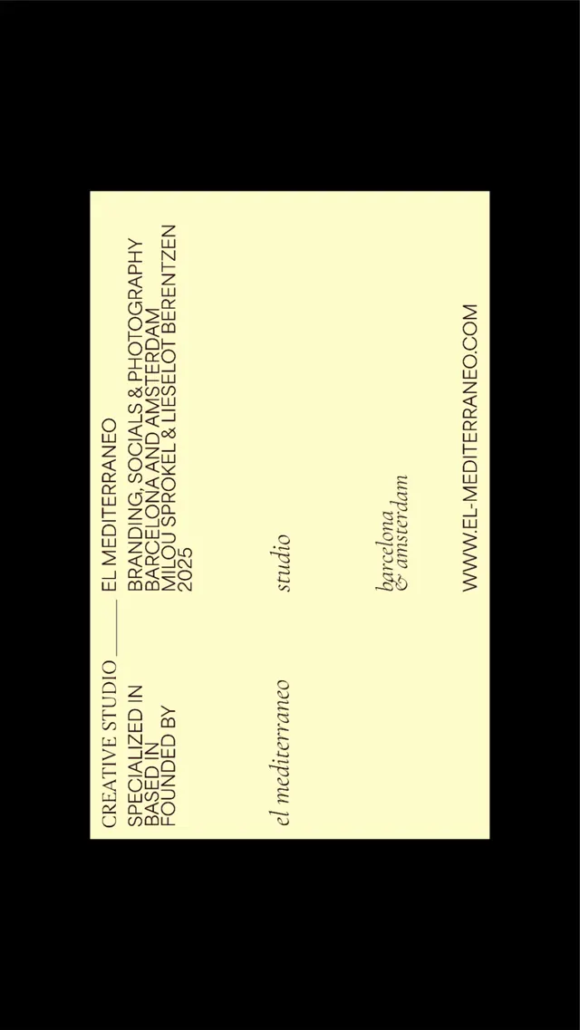
Preview image. Unlock full-res
Business card identity with minimal typography on high-contrast black and cream, featuring vertical text hierarchy and elegant serif-and-sans mix on a portrait-format card.
Summary
Studio business card in portrait orientation, using monochromatic cream-on-black palette with vertical type hierarchy and mixed serif-sans typography.
Visual description
A black background frames a portrait-format cream card. The left edge has vertical uppercase sans-serif text reading the studio's descriptor: "CREATIVE STUDIO SPECIALIZED IN BASED BY FOUNDED" (stacked). Center of the card displays "studio" in smaller italic serif, below which sits "bcrdrum & inctildrm" in a lighter, modern serif. The right edge shows a vertical website URL in minimal uppercase sans-serif. The overall composition is sparse, using negative space and vertical text alignment to create a restrained, sophisticated visual rhythm.
Key takeaway
The vertical text orientation creates a distinctive reading direction that forces engagement. The mix of serif (for the studio name) and sans-serif (for descriptors and contact) creates subtle hierarchy without visual noise. The high-contrast black-cream palette is timeless and costs nothing to print.
Reuse notes
Ideal for creative studios, design agencies, and portfolios that want quiet sophistication. The portrait orientation is memorable for business cards and works well in stacked displays. Note that the typography mix requires careful serif selection to feel intentional rather than eclectic; a single serif for the core identifier and sans-serif for supporting info works best.
More like this


Keep what you find
A free account saves references to boards and can send you a weekly email of picks based on what you save.
To see every result, go Pro.