Preview image. Unlock full-res
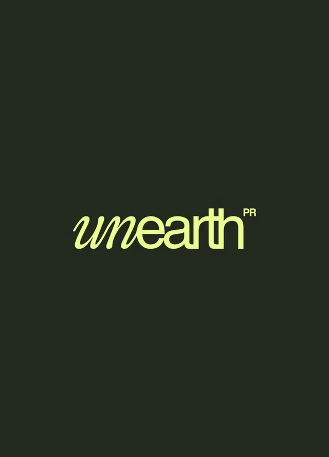
A public relations firm wordmark featuring an italicized, flowing serif logotype in bright lime-yellow against a deep charcoal background, with small superscript 'PR'.
Summary
A public relations firm wordmark featuring an italicized, flowing serif logotype in bright lime-yellow against a deep charcoal background, with small superscript 'PR'.
Visual description
The logotype "unearth" is rendered in a custom italic serif with a forward slant and generous stroke weight, creating a confident, dynamic presence. The bright lime-yellow (#F3FF9A) vibrates against the dark charcoal ground, creating extreme contrast. The letterforms have a flowing, organic quality despite being serif-based. The small "PR" superscript sits to the right in a more upright, minimal sans-serif, suggesting the full name. The composition is centered and tightly cropped, leaving substantial empty space above and below the text. No additional graphics, patterns, or decorative elements accompany the mark.
Key takeaway
The italic serif choice is unexpected for a corporate identity and signals confidence and contemporary taste. The monochromatic color choice (one logo color + background) eliminates decoration while maintaining high impact. The size contrast between the wordmark and the "PR" creates clear hierarchy. The serif italic is more memorable than a standard sans.
Reuse notes
Effective for creative agencies, PR firms, publishing, or editorial consultancies. The lime-yellow reads best on dark backgrounds. The italic serif may feel dated if overused in competitive verticals. Strong as a primary mark but benefits from a secondary stacked or alternate version for smaller applications.