Preview image. Unlock full-res
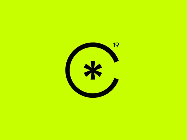
A stark, high-contrast logo: a segmented circular arc with a central asterisk on a solid neon lime background, suggesting refresh, sync, or loading in a utility mark style.
Summary
A stark, high-contrast logo: a segmented circular arc with a central asterisk on a solid neon lime background, suggesting refresh, sync, or loading in a utility mark style.
Visual description
A centered mark on a uniform acid-green background (RGB lime, nearly neon). The mark itself is pure black and geometric: a circular arc made of three thick strokes (missing the bottom quadrant like a pac-man mouth), with a bold five-pointed asterisk or star centered inside. The number "19" appears in the top-right, possibly a version number. The overall effect is stark and instantly readable at small sizes, typical of app-icon or interface-symbol design.
Key takeaway
The restrained mark-to-ground contrast that makes the logo readable at any scale. The refresh or sync semantics conveyed purely through geometry (the open circle + asterisk). The use of neon against black for maximum pop without losing legibility.
Reuse notes
Ideal for tech, SaaS, or developer tools needing a confident icon. Works at small sizes (app icons, buttons, favicons). The neon-lime choice is trendy and high-energy, best suited to modern startups or consumer apps. Pair with black and white for stationery or web, letting the lime become a spot color.