Preview image. Unlock full-res
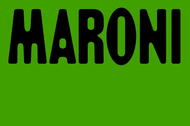
MARONI set in a heavy rounded display type, in black on a vivid lime-green field, with a small lowercase 'a' breaking the otherwise all-caps line.
Summary
A single-word logotype, "MARONI", in a heavy rounded display typeface, black on a flat lime-green field, with one lowercase rounded "a" interrupting the tall all-caps line.
Visual description
The word sits across the top half of a uniform lime-green frame, leaving the lower half as empty color. The letters are very tall and weighty with thick strokes and soft, rounded terminals, giving a chunky almost cartoon-poster feel rather than a sharp grotesque. The "M", "R", "O", "N", "I" are tall capitals nearly filling the cap height, while the second character is a small lowercase "a" with a round bowl that drops the eye and adds a quirky rhythm to the line. The O is a near-perfect tall ellipse. There is no secondary type, mark, or border, just the high-contrast black-on-green logotype.
Key takeaway
Dropping a single lowercase rounded "a" into an otherwise tall all-caps word breaks the uniformity and gives the logotype a memorable, slightly off-kilter signature. The rounded heavy terminals make black-on-acid-lime feel friendly instead of aggressive.
Reuse notes
Good reference for a food, snack, or consumer brand that wants punchy and playful over corporate. The two-tone black-on-lime is loud by design and needs space around it; reserve it for packaging fronts, posters, or app icons where the wordmark can carry the whole frame.