Preview image. Unlock full-res
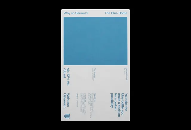
Type specimen branding card featuring tab navigation, a large teal color field, and dense multi-column typography documenting font weights and ingredient information.
Summary
A minimal type specimen card with tab-style headers and a dominant teal color block, using structured multi-column typography below to display font weights and product information.
Visual description
The card is centered on a dark background with rounded white borders. Two tab headers at the top read "Why so Serious?" (left) and "The Blue Bottle" (right), both in a calm blue color. A large teal rectangle occupies the upper half of the card, creating a bold color anchor. The lower half is divided into three columns of small sans-serif text in matching teal, displaying ingredient information and typography specifications. A small geometric logo mark in teal sits at the bottom left of the card.
Key takeaway
The tabbed header treatment for organizing product variants or related content sections. The large, uninterrupted color field as a strong visual anchor that also frames typography below. The use of dense, multi-column text layout to display technical or ingredient details without cluttering the visual hierarchy.
Reuse notes
Effective for beverage, food, or consumer product branding where ingredient transparency or nutrition information needs prominence. Works well for design specs or type documentation. The teal-on-white color scheme is clean enough for healthcare or wellness contexts. The structured layout handles dense text without visual chaos.
More like this




Keep what you find
A free account saves references to boards and can send you a weekly email of picks based on what you save.
To see every result, go Pro.