Preview image. Unlock full-res
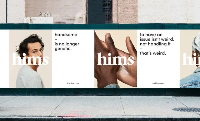
Lifestyle magazine spread layout with teal header, cream body, and earth-tone photography balanced across three vertical panels with sans-serif headlines.
Summary
Lifestyle magazine spread layout with teal header, cream body, and earth-tone photography balanced across three vertical panels with sans-serif headlines.
Visual description
A three-column editorial layout anchored by a dark teal horizontal band at the top. Left column is cream with a tonal photograph of hands and a coffee cup, right column shows darker teal with lifestyle photography. The central cream section contains body copy in small serif type. The composition is strictly columnar, dividing the horizontal space into equal vertical thirds with the teal band creating a dramatic top anchor. Skin-tone and natural light photography throughout. No decorative elements beyond the color structure and typography. Spacing is generous and breathing room is carefully preserved.
Key takeaway
The horizontal teal band as a strong visual anchor that grounds the spread without competing with the imagery. The three-column system that lets different image types and text weights sit comfortably side by side. The restraint in typographic choice, letting the layout structure do the visual work.
Reuse notes
Perfect for lifestyle or wellness magazines wanting understated sophistication. The teal-cream-brown palette is earthy and approachable. Works well when you have strong documentary-style photography to anchor each section. The symmetrical column division suits regular feature formats but can feel rigid for opinion or opinion-heavy content.
More like this





Keep what you find
A free account saves references to boards and can send you a weekly email of picks based on what you save.
To see every result, go Pro.