Preview image. Unlock full-res
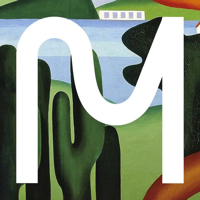
A bold, white sans-serif M rendered as overlapping organic shapes, layered against a landscape-like background of muted greens, blues, and warm tones.
Summary
A bold, white sans-serif M rendered as overlapping organic shapes, layered against a landscape-like background of muted greens, blues, and warm tones.
Visual description
A large capital M in pure white sits at the center, its form constructed from flowing, curved shapes that suggest both letterform and abstract landscape. Behind and around the M, stacked organic shapes create depth: vertical bands of muted forest green, olive green, pale blue sky, and warm terracotta tones at the edges. The shapes overlap and create the illusion of rolling hills or layered geography. A black triangular cutout sits at the top, adding graphic pop against the lighter background. The overall composition balances strict letterform geometry with fluid, biomorphic forms.
Key takeaway
The idea of a letter as a container for landscape imagery; using pure white against earth tones for maximum contrast; building dimensionality through overlapping organic silhouettes rather than shading or perspective; the tension between the hard, clean letterform and the soft, flowing background shapes.
Reuse notes
Excellent for brands seeking a modern, nature-inspired wordmark that is both minimal and visually rich. Works in single color (the white form would read clearly). Pairs well with organic, environmental, or wellness-focused brands. The custom-drawn approach signals craft and exclusivity.