Preview image. Unlock full-res
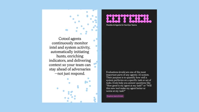
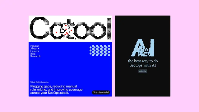
A SecOps brand layout pairing a dot-matrix Cotool logotype over an electric-blue navigation panel with a black product card on a pale pink background.
Summary
A tech-forward brand system on a soft-pink ground: the Cotool logotype rendered entirely in dot-matrix form sits above an electric-blue navigation block with halftone ornaments, paired with a black card stating "the best way to do SecOps with AI".
Visual description
Two vertical panels float on a pale pink canvas. The left, wider panel divides into a white header band carrying the wordmark "Cotool" built entirely from small black dots in a dot-matrix style, with scattered red dots breaking through the second "o" as an accent starburst. Below is a solid electric-blue field holding a left-aligned navigation list (Product, About, Careers, Blog, Research) in white, a dense cluster of light-blue halftone dot rows occupying the top-right corner, a small "What Cotool can do" label, short white product copy, and a rounded black "Start free trial" button bottom-right. The right panel is pure black, featuring a large light-blue dot-matrix "A.I." as the visual centerpiece, below which a serif line reads "the best way to do SecOps with AI", with a small rounded "cotool.ai" pill label. Dot-matrix letterforms carry throughout, unifying logo, hero numeral, and halftone accent.
Key takeaway
A single geometric construction system, the dot matrix, becomes distinctive and ownable across the entire visual identity when applied consistently to the logo, hero type, and decorative elements. The accent color (red) is sparse and concentrated, so it reads as intentional rather than chaotic. The soft-pink backdrop makes a cool-toned tech palette feel contemporary and less corporate.
Reuse notes
Strong template for a developer-tool, AI, or cybersecurity startup that needs a distinctive technical aesthetic without resorting to generic geometric sans-serif. The dot-matrix approach works best at large scale (logos, hero numbers) and becomes noise at small sizes, so pair it with a clean fallback wordmark for apps and narrow contexts. The three-color core (electric blue, black, white) stays legible; the pink and red are optional intensifiers for hero/presentation use.