Preview image. Unlock full-res
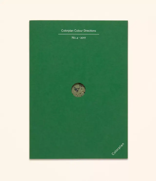
Colorplan Color Directions is a publication cover with deep green field, minimal white typography, and a circular camouflage swatch opening.
Summary
A publication cover for a color-direction guide, using a solid deep-green field with minimal white typography and a circular die-cut revealing a camouflage color sample.
Visual description
Vertical cover centered on a solid deep forest-green field. At top, white sans-serif text reads "Colorplan Colour Directions" separated by a thin horizontal line, with "No.4, 2017" below. Centered slightly lower, a circular window die-cut reveals a camouflage-pattern color swatch visible underneath, creating a tactile reveal. Bottom right corner displays "Colorplan" in small white sans-serif. The entire composition sits on an off-white mounting board, visible at edges.
Key takeaway
The circular swatch window as a design system element balances minimalism with product information, showing color rather than naming it. The placement of publication metadata (number, year) immediately below the main title creates a clear editorial hierarchy. The ratio of color field to white type is generous and confident, relying on the ink choice itself as design.
Reuse notes
Ideal for product publications, color guides, and any branded materials where a physical swatch adds value. Works best when the color itself is the subject. The die-cut is a print luxury; digital adaptations should show the swatch as a separate element.
More like this







Keep what you find
A free account saves references to boards and can send you a weekly email of picks based on what you save.
To see every result, go Pro.