Preview image. Unlock full-res
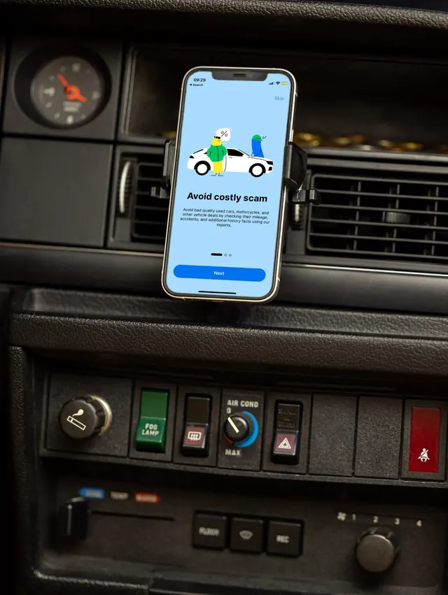
Phone mounted on a worn car dashboard showing a pale blue app onboarding screen with a flat character illustration and a blue Next button.
More like this
See all


Summary
A product shot that puts the app where it is actually used: clipped to the air vent of an old car, its bright pale blue onboarding screen glowing against black textured plastic and worn switchgear.
Visual description
Shot in portrait. A phone sits in a black vent clamp mount in the upper half of the frame, centered against a dark dashboard. The screen is pale blue edge to edge. At the top, the status bar reads 09:29 and a blue "Skip" link sits at the right. Below it, a flat illustration: a white car in side view with black wheel outlines, a yellow character in a green jacket standing in front of it holding a speech bubble with a percent sign, and a blue character in a green cap leaning at the rear. Under the illustration, "Avoid costly scam" is set centered in bold black sans, followed by four lines of small centered grey body copy about checking mileage, accidents and history. Near the bottom, three pagination indicators show the first as an elongated active dash, then a full-width blue pill button with white "Next". Around the phone: a round analogue clock with a red hand at upper left, horizontal vent slats, and a lower bank of physical switches labelled FOG LAMP in green, AIR COND with a blue dial, a red hazard switch and a cigarette lighter knob, all in cracked black plastic.
Key takeaway
Contrast as the whole idea. The soft pale blue and rounded vector art look modern precisely because they are framed by scuffed 1980s switchgear, which also states the product proposition (old cars, hidden history) without a word of copy.
Reuse notes
Reach for this when an app screenshot needs to argue for the product's context, not just show the UI. The vent mount keeps the screen close to parallel with the sensor so the interface stays legible, which most in-car shots get wrong. Needs a dashboard with visible character; a modern black slab interior kills the contrast.
More like this



Keep what you find
A free account saves references to boards and can send you a weekly email of picks based on what you save.
To see every result, go Pro.