Preview image. Unlock full-res
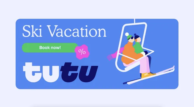
A wide periwinkle banner pairing a serif "Ski Vacation" headline and green CTA pill with a flat illustration of two skiers on a chairlift.
More like this
See all

Summary
A horizontal promotional banner split down the middle, with three stacked type elements on the left and a single illustration bleeding off the right edge.
Visual description
A rounded corner rectangle in cornflower blue sits on a pale lavender ground. The left half stacks three items ranged left: "Ski Vacation" in a large pale serif with generous letter spacing; a green pill button reading "Book now!" in white bold sans, overlapped at its right end by a magenta blob badge carrying a white percentage sign; and beneath them the Tutu wordmark at large size, here in near white for the upright half and deep navy for the italic half. The right half holds a flat illustration of a chairlift: a white bar and cable frame with two seated figures in orange and green jackets, striped beanies, sunglasses, a trailing pink scarf and pink and navy trousers, their skis crossing the lower edge of the panel. The illustration crops against the banner edge on the right.
Key takeaway
Overlapping the discount badge onto the end of the CTA pill fuses offer and action into one shape, so the eye gets both in a single stop. Recolouring the wordmark so its italic half matches the darkest element on the banner keeps the logo present without letting it compete with the button.
Reuse notes
A practical layout for seasonal promo banners and email headers where the message is destination plus offer plus action. Needs the illustration to survive being cropped, so build artwork with a clear subject and no important detail at the edges. The green button is the only warm accent, and swapping it for a brand colour close to the background would collapse the hierarchy.