Preview image. Unlock full-res
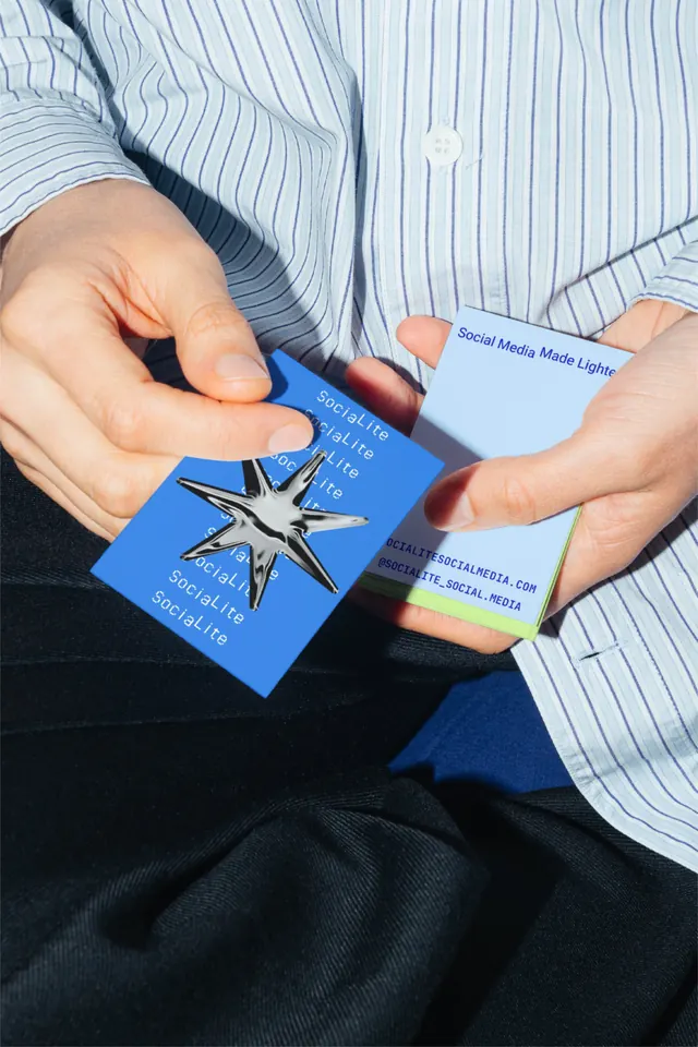
Two-tone business cards with repetitive typography and a distinctive die-cut star aperture, presented in hands against a striped shirt.
Summary
Tactile business card identity featuring a die-cut star aperture and repeated "Social Lite" typography in blue and white, photographed being held in hands against a striped shirt.
Visual description
Two layered business cards in a person's hands, both featuring a rich blue background with white repeated text reading "Social Lite" and "Social Media." The card in the foreground has a striking geometric star-shaped die-cut, creating a negative-space aperture that reveals the layered card beneath. The second card shows a solid blue face with the same typography. A subtle orange-toned accent strip appears on one edge. The lighting is natural and bright, emphasizing the tactile nature of the physical cards against the white striped shirt and dark clothing worn by the presenter.
Key takeaway
The die-cut aperture as a distinctive tactile element that encourages handling and reveals multiple layers, turning the business card into a conversation piece. The bold repetition of brand text (not a logo) as the primary visual anchor. The smart use of product photography to showcase the physical interaction and material quality of the collateral.
Reuse notes
Excellent for startups and digital-marketing agencies wanting to stand out with unexpected physical branding. The die-cut adds manufacturing cost but creates memorable unboxing and exchange moments. Works best when the brand name or product identity is strong enough to carry the design without additional imagery or a lockup.
More like this






Keep what you find
A free account saves references to boards and can send you a weekly email of picks based on what you save.
To see every result, go Pro.