Preview image. Unlock full-res
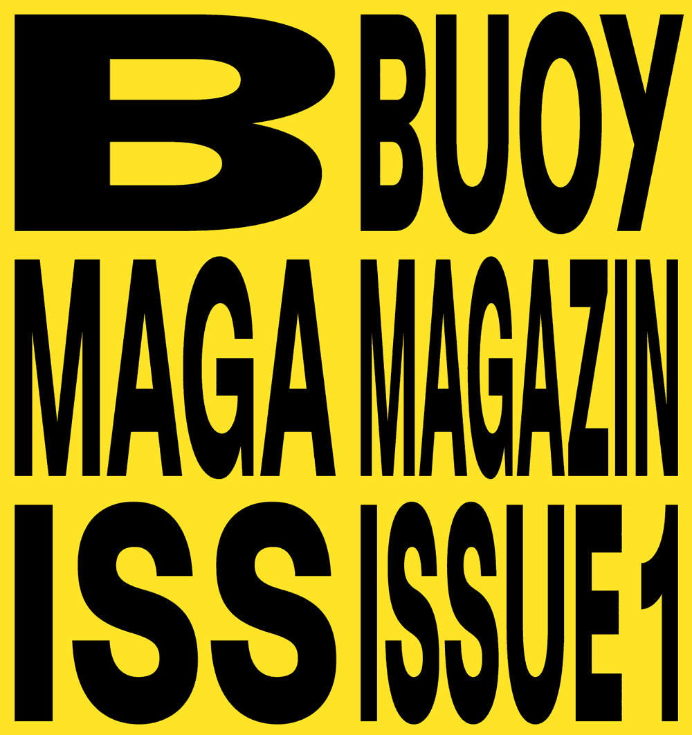
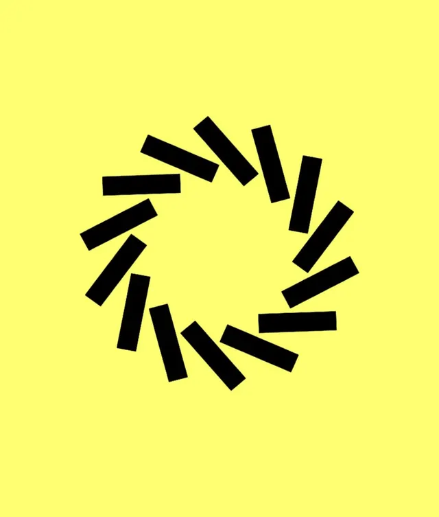
An abstract logo of thick black rectangular bars arranged in a radial sunburst pattern on a pure bright yellow background, radiating outward from a tight center.
Summary
A maximally high-contrast mark: thick black bars fanning outward in a radial burst against a flat, bright yellow background, creating a sense of motion and urgency.
Visual description
Approximately 14-16 black rectangular bars of varying lengths, rotated around a central point and arranged symmetrically to form a complete 360-degree sunburst or radiating mark. The bars grow and shrink slightly, creating rhythm and balance; they do not form a closed shape, so the yellow background reads through the negative space. The yellow is saturated and pure (no tint, no texture), making the black bars pop with absolute contrast. The overall effect suggests energy, motion, or a light source.
Key takeaway
The radial bar arrangement is a flexible pattern language: thick geometry rotated concentrically works for logos, icons, and abstract branding. The yellow-and-black combo is polarizing and scannable, useful for brands that want to cut through visual noise. The simplicity (just bars, no curves or detail) makes it versatile across contexts.
Reuse notes
Best for brands aiming for youthful energy, tech startups, or playful contexts; the brightness and motion read modern. Yellow-and-black combos work well for warning/caution connotations (construction, safety) or sunny/optimistic ones (energy, solar, joy)—context matters. Scales well down to favicon/small-size applications because of the geometric clarity.