Preview image. Unlock full-res
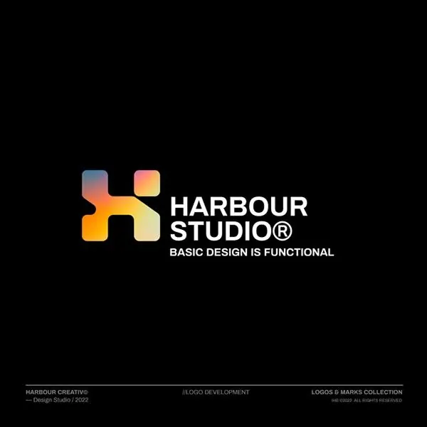
Harbour Studio: abstract geometric 'H' mark with warm orange-to-yellow gradient, accompanied by sans-serif wordmark and tagline on black.
Summary
Harbour Studio: an abstract geometric "H" mark with warm orange-to-yellow gradient, paired with clean sans-serif wordmark and tagline on black.
Visual description
A geometric mark constructed from overlapping or interlocking rectangular shapes that form an abstract letter "H", filled with a smooth gradient from cool coral-orange on the left to warm yellow on the right. The mark sits centered at left-of-center in the composition. To its right, the wordmark "HARBOUR STUDIO" is rendered in clean, unadorned sans-serif (appears to be a system or neutral typeface) in white, positioned at the mark's vertical center. Below the wordmark, a smaller line reads "BASIC DESIGN IS FUNCTIONAL" in a thin sans-serif weight, reinforcing a minimalist philosophy. At the bottom, small gray text credits "Design Studio / 2022" and a copyright line. The entire composition sits on a pure black background.
Key takeaway
The gradient fill on a geometric letterform (here, the 'H') is a modern, distinctive touch that avoids feeling dated or trendy. The warm warm-to-cool color shift draws the eye within the mark itself. The pairing of a bold mark with a clean, minimal wordmark and a philosophical tagline establishes a confident brand voice. Black background + white type + one warm gradient accent is a powerful, high-contrast formula.
Reuse notes
Well-suited for design studios, creative agencies, or tech companies seeking a warm but professional identity. The tagline "Basic Design is Functional" signals expertise and clarity, ideal for brands positioning on principle rather than decoration. The gradient is subtle enough to work at small sizes (favicon, app icon) but striking enough for display use.