Preview image. Unlock full-res
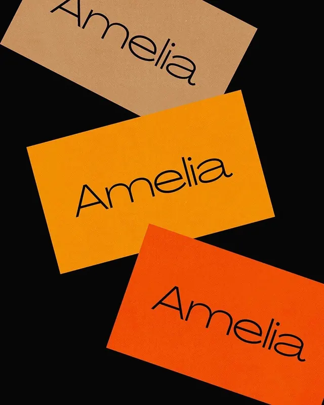
Three overlapping cards displaying the "Amelia" wordmark in a thin geometric sans-serif across warm color variations against a black background.

Summary
Three overlapping rectangular cards display the "Amelia" wordmark in a thin, geometric sans-serif across warm color variations—tan, bright orange, and red-orange—layered diagonally on a black background.
Visual description
Three rectangular cards are arranged in a cascading, rotated composition. Each features the wordmark "Amelia" in thin, minimalist sans-serif lettering with geometric proportions. The cards are colored tan/beige (top), bright orange (middle), and red-orange (bottom), with each wordmark rendered in dark navy outlines for high contrast. The overlapping arrangement creates depth against the solid black background. Spacing and rotation emphasize the modular nature of the identity system.
Key takeaway
A clean demonstration of how a single wordmark gains visual impact and modularity through color and spatial variation. The thin geometric sans-serif paired with bold, warm color blocking creates a modern, premium feel. The overlapping card composition is a practical way to showcase brand identity extensions.
Reuse notes
Excellent reference for building color-variable brand systems or wordmark identity variations. The composition works well for brand guidelines, moodboards, or design system documentation. The geometric sans-serif typeface and color palette pair well with contemporary, design-focused brands. Note: the high-contrast color blocking is essential to the design's impact.
More like this








Keep what you find
A free account saves references to boards and can send you a weekly email of picks based on what you save.
To see every result, go Pro.