Preview image. Unlock full-res
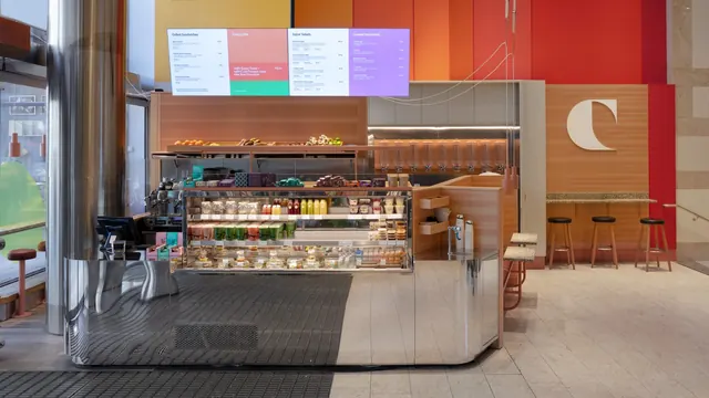
Retail food counter photographed head on, with a four-panel digital menu overhead and a large cream C mark on a red and orange striped wall.
More like this
See all


Summary
The identity read at room scale: a striped red and orange wall, an oversized cream initial and a colored menu screen doing all the branding in an otherwise material driven interior.
Visual description
A straight-on photograph of a food counter inside a larger building. The back wall is color blocked in vertical bands of yellow, orange and two reds, with a tall cream sans serif letter C mounted on the right hand red panel at roughly door height. Above the counter hangs a wide screen showing a four-panel menu: white panels headed "Grilled Sandwiches", "Super Salads" and "Loaded Smoothies" in dark type, a salmon "Todays offer" panel with a green strip at its foot, and a lilac panel at the right. The counter itself is polished stainless steel with a faceted front, holding a glass fronted chilled display of bottled juices, cups of prepared food, salads and pastries on three levels, with a wooden shelf of loose citrus and produce above. To the left sit a card terminal and an espresso machine; to the right, a pale wood cabinet run with a row of clear gravity dispensers under a lit shelf, coral pendant lamps, a speckled terrazzo ledge and three wooden stools with black seats. The floor is pale stone with a dark metal grate in front of the counter, and a glazed shopfront at the far left reflects the street.
Key takeaway
A flat wall of color bands plus one very large letter gives a small retail footprint an identity at a distance, without applying the logo to any fixture. Letting the menu screen carry the full palette means the physical materials can stay neutral wood, steel and stone and never date.
Reuse notes
A good reference for grab and go, juice bar or cafe formats inside a mall or station where the unit must read from across a concourse. The oversized monogram needs an uninterrupted wall panel to sit on, so plan it before the joinery. The striped wall carries a lot of chroma already, which is why the fixtures stay muted; adding colored joinery would overload it.
More like this





Keep what you find
A free account saves references to boards and can send you a weekly email of picks based on what you save.
To see every result, go Pro.