Preview image. Unlock full-res
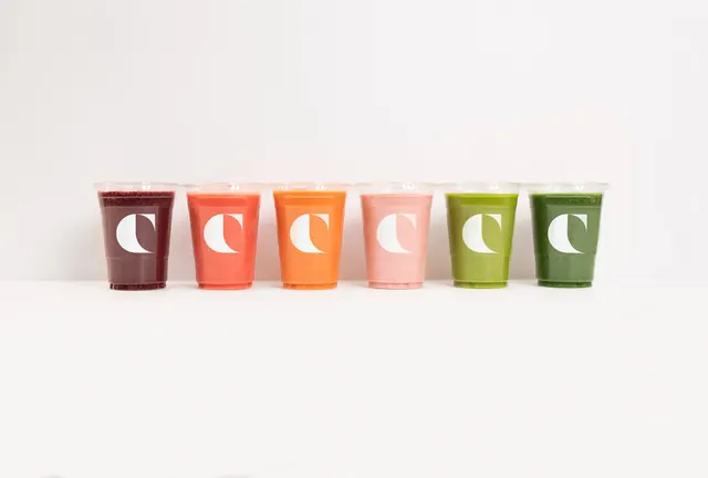
Six clear smoothie cups lined up left to right in a berry-to-green color run, each carrying the same white C mark.
More like this
See all

Summary
The product itself supplies the palette: six identical clear cups become a color range purely through what is inside them, with one white mark repeated on every unit.
Visual description
Six lidded clear plastic cups stand in a single row against a pale grey-white seamless backdrop, evenly spaced and aligned on a shared baseline that sits just below the vertical centre of the frame. Contents run left to right from deep beetroot purple through coral red, orange, pale strawberry pink, bright lime and finally dark spinach green. Each cup carries the same white C mark, screen printed at identical size and height so the marks form a straight horizontal band across the row. The cups are ribbed near the base, catching a little light, and the drinks read as flat blocks of opaque color. Nothing else is in the frame: no type, no props, no visible shadow beyond a faint contact line.
Key takeaway
Printing one white mark at one fixed size and height across every SKU turns a range shot into a single graphic device. The flavour coding is carried entirely by the ingredients, so no additional labelling system is needed.
Reuse notes
Ideal for a range or menu overview slide, a launch announcement, or an ecommerce category hero where the product line spans natural colors. Only works with genuinely transparent packaging and visually distinct products; it collapses if two flavours land on similar hues. Pairs well with a plain white or bone background.