Preview image. Unlock full-res
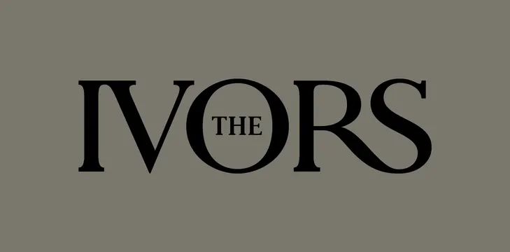
The Ivors identity features a nested serif wordmark where 'THE' wraps around a centered circle, creating a refined, self-contained badge.
Summary
The Ivors wordmark uses a thin, elegant serif typeface where the letters I-V-O-R-S are arranged with 'THE' positioned to wrap around a circular negative space in the center, creating a symmetrical badge-like form.
Visual description
Centered on a muted gray-green background, the wordmark is rendered in solid black serif type. The letters are generously spaced and use a refined serif font with moderate contrast. 'IVORS' forms the outer frame while 'THE' nests inside, curving slightly around a clean circular void in the middle. No additional ornament, color, or texture; the design relies entirely on letterform, geometry, and whitespace. The monochromatic approach and even stroke weight emphasize the logo's clarity and timelessness.
Key takeaway
The concentric nesting of text around a circle is a clever compositional trick that works at any scale and creates instant visual stability. The use of a classic serif typeface with generous spacing communicates established authority and prestige without appearing dated. The pure monochrome approach proves that restraint and geometry can be more striking than color.
Reuse notes
Suited to luxury brands, cultural institutions, or award bodies seeking an elevated, print-friendly identity. The circular geometry scales from embroidery to posters. The serif choice works for publishing, music, and awards; adapt the typeface family for different industries while preserving the nesting logic.
More like this

Keep what you find
A free account saves references to boards and can send you a weekly email of picks based on what you save.
To see every result, go Pro.