Preview image. Unlock full-res
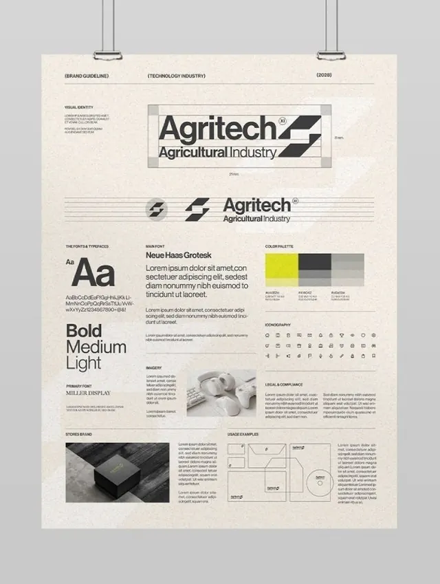
A comprehensive agricultural brand identity guideline document using Neue Haas Grotesk, geometric logo variations, and a structured grid system across a beige paper background.
Summary
A comprehensive agricultural brand identity guideline document using Neue Haas Grotesk, geometric logo variations, and a structured grid system across a beige paper background.
Visual description
A printed brand guidelines sheet on cream paper showing the Agritech identity. The logo uses bold black geometric shapes stacked diagonally, with a wordmark below. The sheet displays the primary typeface Neue Haas Grotesk in multiple weights (Bold, Medium, Light) and sizes. A color palette section shows four colors: bright yellow, charcoal black, and two neutral grays. Below are sections for icon set (monochrome line-based icons in a grid), photography guidelines (black and white agricultural imagery), and usage diagrams showing proper spacing and proportions. The overall aesthetic is disciplined and systematic, with generous white space and a structured column grid.
Key takeaway
The approach of presenting a complete, cohesive system on a single sheet: combining logo construction rules, primary typeface display, limited color strategy, and icon/imagery guidance creates a self-contained visual reference. The use of a warm neutral background (not pure white) makes the documentation itself feel intentional and branded.
Reuse notes
Ideal for B2B brands, agricultural or tech companies needing to project professionalism and precision. The grid-based layout ensures clarity when scaling or adapting the system. Works well for industries where consistency and structural clarity matter more than visual novelty.
More like this







Keep what you find
A free account saves references to boards and can send you a weekly email of picks based on what you save.
To see every result, go Pro.