Preview image. Unlock full-res
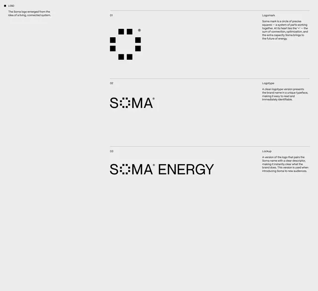
A comprehensive identity system for 'Soma Energy' featuring a modular logo built from stacked squares, supported by clean typographic lockups and detailed brand documentation.
Summary
An energy company's brand identity system centered on a modular square-glyph logo, presented with typographic variations, lockup guidelines, and explanatory copy describing the brand's visual principles.
Visual description
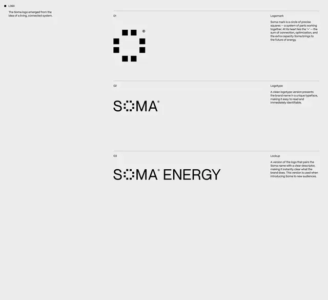
Light gray background organized into a three-section layout. Top section labeled "Logo" shows a black mark composed of nine squares arranged in a circular pattern around a central empty space, with explanatory text. Middle section labeled "Logotype" presents the wordmark "SOMA" in a clean sans-serif, the center letters replaced with small black squares that continue the modular mark's visual language. Bottom section labeled "Lockup" shows the extended form "SOMA ENERGY" combining the wordmark with the descriptor. Right column contains brand narrative text explaining the mark's system of connected parts and optimization.
Key takeaway
The modular approach: a single small element (the square) repeats and arranges to form both mark and wordmark variation, creating instant visual coherence. The integrated typographic treatment where the mark embeds itself into the letterforms. The hierarchical layout presentation: concept, clean version, applied version, all on one page, communicating the system's flexibility.
Reuse notes
Ideal for B2B, energy/sustainability, or tech brands seeking a geometric, forward-thinking identity. The monochromatic palette ensures consistency across all applications and budgets. The modular logic scales from favicon to billboard. Include similar documentation (concept, mark, lockup, extended versions) when presenting a system to stakeholders. Best on light backgrounds; inverse versions would need careful type color management.
More like this







Keep what you find
A free account saves references to boards and can send you a weekly email of picks based on what you save.
To see every result, go Pro.