Preview image. Unlock full-res
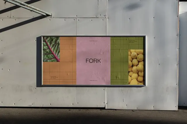
Restaurant signage using four discrete color fields (orange, pink, green, tan) to frame a central wordmark on a horizontal black-edged panel.
Summary
A mounted restaurant signage using four warm-muted color blocks to frame the centered wordmark, creating a modern, structured composition.
Visual description
Horizontal rectangular sign mounted outdoors, with a black border and frame. The sign is divided into four color fields: a tan-orange block on the left, salmon pink in the center-right containing the "FORK" wordmark in black sans-serif, an olive-green field on the upper right, and thin tan stripe on the bottom. The wordmark is simple, lowercase, sans-serif. Behind the central panel, a photographic element is visible (leafy plants or produce) in the upper left and bottom right, adding organic texture. The overall geometry is strict and rectilinear, creating a gallery-like presentation.
Key takeaway
The color-field framing technique - using four distinct, warm muted tones as separate zones to isolate and elevate a central wordmark. The interplay of photography peeking behind structured color blocks adds depth without cluttering the wordmark itself.
Reuse notes
Strong for restaurant, food, or lifestyle brands seeking a modern, structured look. Works well at scale as exterior signage. The geometric color compartments help the wordmark read clearly from a distance while the subtle photography adds warmth and context.