Preview image. Unlock full-res
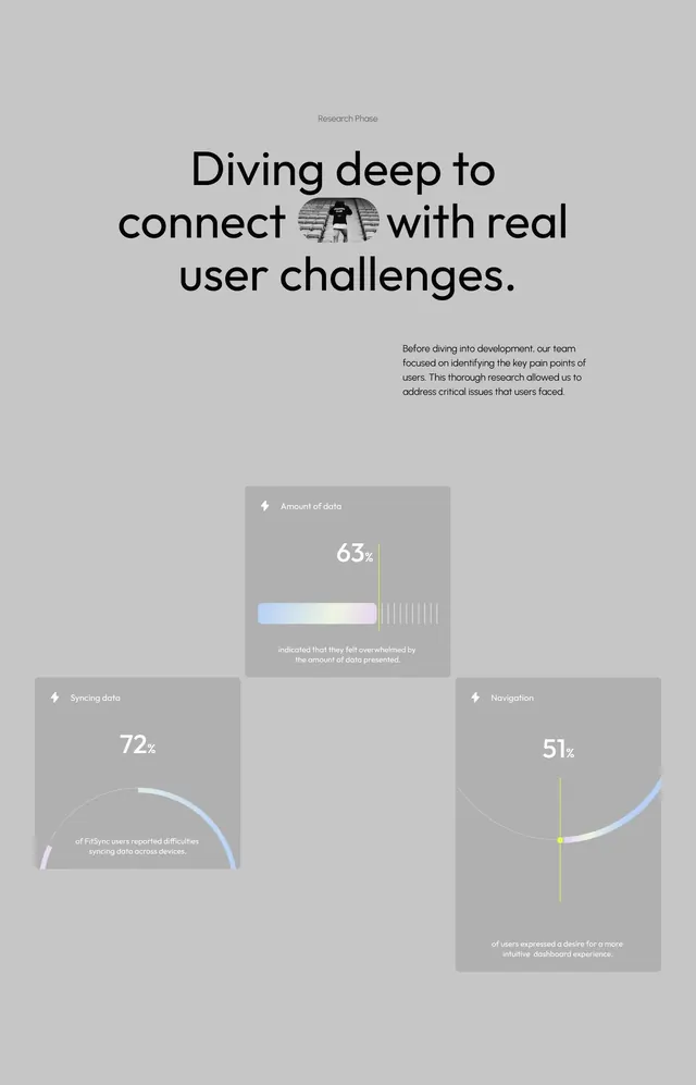
Neutral-gray page displaying three finding cards: a research phase headline, a central card showing 63% data overwhelm, and two bottom cards showing 72% sync issues and 51% navigation friction.
Summary
A research findings page presents three key metrics in separate cards: data overwhelm at 63%, data sync issues at 72%, and navigation friction at 51%, each with a progress arc, lightning bolt icon, and caption explaining the finding.
Visual description
A light gray background page titled "Research Phase" at the top. Below, a large black headline reads "Diving deep to connect with real user challenges." The main card (center, lighter gray background) shows a bold white "63%" with a light-to-yellow gradient bar and striped icon, labeled "Amount of data" with explanatory text below. Two smaller cards flank the bottom: the left card displays a circular progress arc in pale blue and purple, showing "72%" for syncing data; the right shows a curved arc in pale blue and pale green with "51%" for navigation. Both cards have small lightning-bolt icons in their headers. All text is clean, sans-serif, and left-aligned within generous white space.
Key takeaway
The three-card dashboard layout for presenting multiple research findings at once; the use of subtle, differentiated color arcs (pale blue, purple, green, yellow) to distinguish metrics without making the page feel busy; the pairing of large percentage numbers with small supporting text and functional icons; the generous negative space and neutral background that makes every piece of data readable.
Reuse notes
Ideal for SaaS onboarding research, product-metrics dashboards, or UX research reports where you need to present multiple findings with equal weight. The muted color palette (grays, subtle blues, greens, soft yellow) feels corporate and trustworthy without being bland. Icon placement (small lightning bolt) can be swapped for any relevant symbol. Works because the data is the focus, not decoration.