Preview image. Unlock full-res
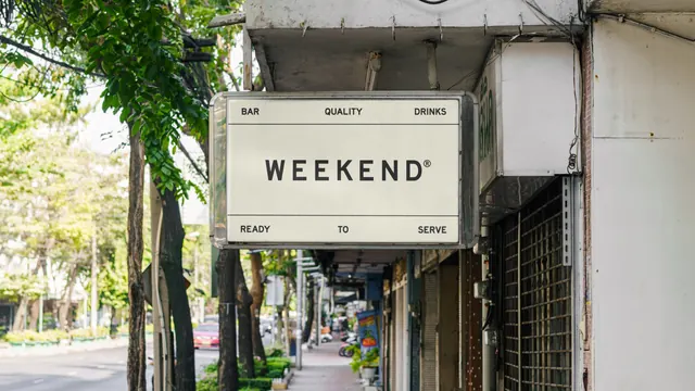
Physical storefront sign for Weekend cocktail bar displaying "BAR·QUALITY·DRINKS", the brand name, and "READY·TO·SERVE" in clean sans-serif typography.
Summary
A cream-colored storefront sign with black sans-serif typography reading "BAR·QUALITY·DRINKS" above the brand name "WEEKEND®" and "READY·TO·SERVE" below, mounted on a distressed metal frame in a tree-lined urban street.
Visual description
The sign is composed of three text bands separated by thin black lines. The top band reads "BAR · QUALITY · DRINKS" in spaced caps, the center displays "WEEKEND®" in bold sans-serif with a registered trademark symbol, and the bottom reads "READY · TO · SERVE". The cream background provides high contrast with the black letterforms. The metal frame shows age and patina, and the sign is mounted on the storefront of a weathered building with visible windows and industrial hardware. Dappled green foliage from street trees frames the left edge.
Key takeaway
Disciplined three-line typographic hierarchy combined with generous spacing and high contrast creates a legible, sophisticated retail identity that reads clearly from a distance while maintaining elegant minimalism. The hierarchy (descriptors > brand name > descriptor) reinforces the brand's positioning.
Reuse notes
Perfect template for hospitality, retail, or F&B branding where legibility and sophistication matter equally. The wide spacing between letterforms and the substantial line height make this effective for physical signage. Works well with cream/beige on dark palettes and aged materials for a contemporary-vintage aesthetic.
More like this




Keep what you find
A free account saves references to boards and can send you a weekly email of picks based on what you save.
To see every result, go Pro.