Preview image. Unlock full-res
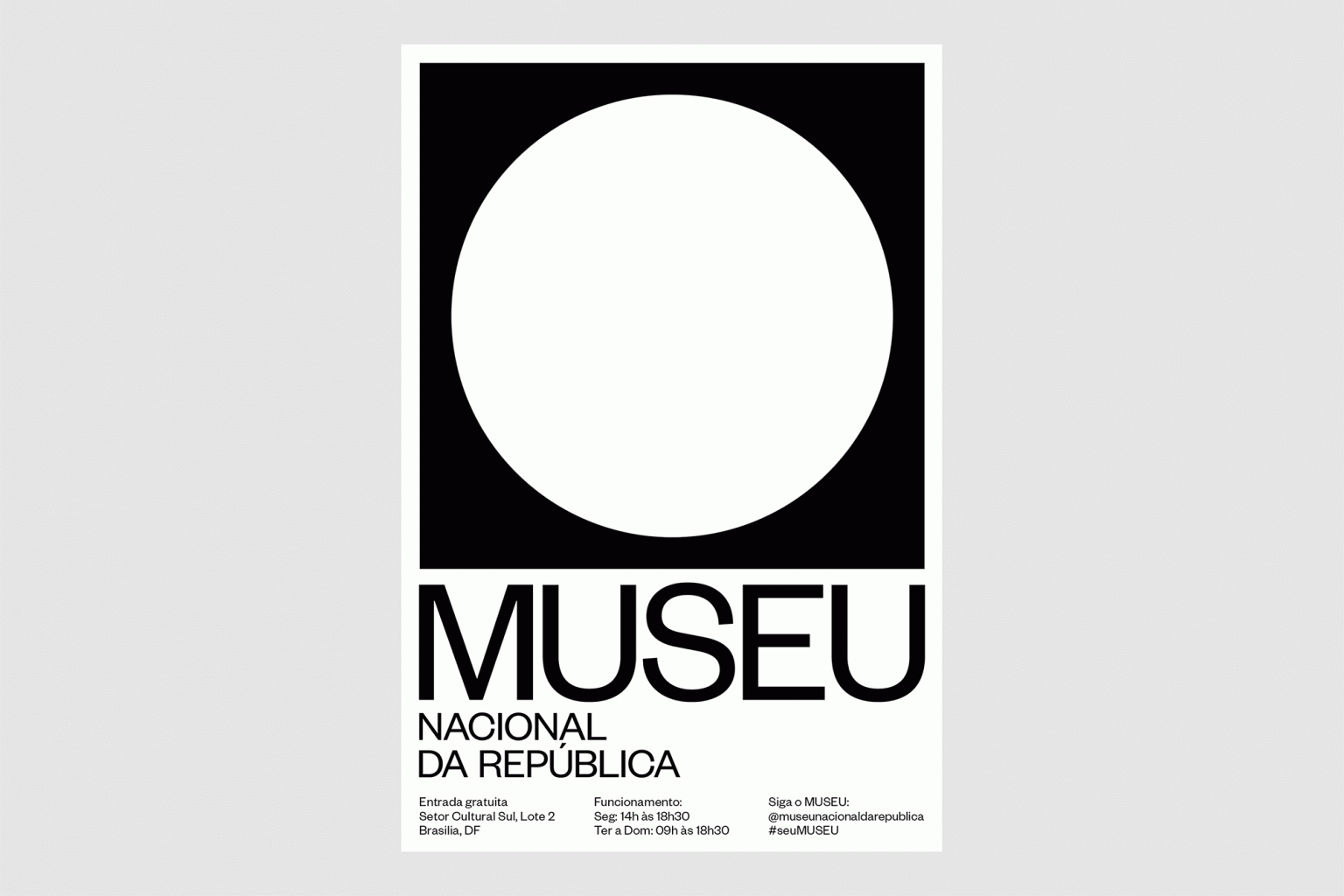
Large white circle enclosed in a black square sits above a sans-serif logotype and institutional text in a modular, high-contrast system.
Summary
Institutional identity for a Brazilian national museum: a white circle in a black square mark above a clean sans-serif wordmark and stacked text details.
Visual description
A centered vertical composition on a white field. At top, a black square containing a large white circle (positive-negative). Below sits the wordmark "MUSEU" in a geometric, modern sans-serif (likely a square sans) with distinctive open letterforms. Below that, smaller sans text in Portuguese: "NACIONAL DA REPUBLICA" aligned left. At the bottom, three columns of small text in sans-serif (open hours, address, social handle) in a tight, modular layout. Pure black and white throughout; no colors or flourishes. Strong baseline alignments and grid structure.
Key takeaway
The white circle in the black square is an instantly recognizable geometric mark that scales down legibly and recalls institutional modernism. The layered typographic hierarchy (large mark, primary wordmark, secondary text) works at any size. The symmetrical layout and ample negative space convey authority and stability.
Reuse notes
Ideal for public institutions, cultural organizations, or educational brands where modernist clarity and neutrality signal trust. The geometric mark works on signage, applications, wayfinding. The clean sans-serif type pair is reproducible with standard foundries. Avoid color overlays that would break the stark contrast.
More like this







Keep what you find
A free account saves references to boards and can send you a weekly email of picks based on what you save.
To see every result, go Pro.