Preview image. Unlock full-res
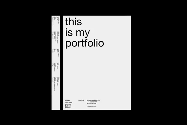
High-contrast Swiss-minimalist portfolio cover pairing a white field with a tall gray-and-white sidebar and large centered sans-serif type, contact details in small footer text.
Summary
A Swiss-minimalist portfolio cover using a tall side margin with rotated text and a single statement in large sans-serif type anchored by contact information at the footer.
Visual description
The left edge features a substantial light gray/off-white margin containing several lines of small rotated sans-serif text (credentials, perhaps education or experience). The main white field is nearly empty, leaving the horizontal center clear until halfway down, where large, bold, black sans-serif capitals read "this is my portfolio". Below this, near the bottom, footer text in small sans-serif lists contact details: name (mane tatoulian), job title (graphic design), email address, phone number, and website URL, all aligned left. The composition relies entirely on spatial contrast and sans-serif geometry for visual interest.
Key takeaway
The sidebar-as-resume pattern: placing descriptive content vertically along the margin while reserving the main field for a single statement. This grid-based approach feels both authoritative and economical. The decision to use small footer contact details rather than a banner or inline block maintains the discipline of the minimal aesthetic.
Reuse notes
Strong for designer, illustrator, or creative professional portfolios where restraint signals confidence. Works particularly well in print (letterhead, covers) where the sidebar can be a consistent design element across multiple pages. The monochrome scheme is flexible (adapt grays to brand colors) and timeless. May feel cold for highly conceptual or playful work; best suited to brands emphasizing precision and clarity.
More like this





Keep what you find
A free account saves references to boards and can send you a weekly email of picks based on what you save.
To see every result, go Pro.