Preview image. Unlock full-res
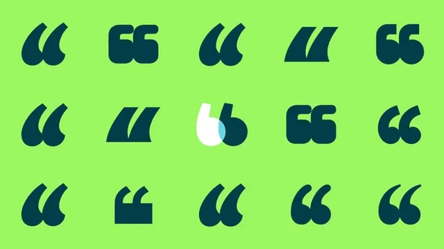
A 3-by-5 grid of stylized quotation mark glyphs in navy on bright lime-green background, demonstrating tonal and formal variations of a single mark.
Summary
A systematic exploration of quotation-mark glyphs rendered in navy across a 3-by-5 grid on a vibrant lime-green background, showing multiple geometric interpretations of the same typographic element.
Visual description
Rectangular canvas of bright lime-green with fifteen navy quotation marks arranged in three rows of five. Each mark is a distinct variation: some are curved and traditional (like curly quotes), others are angular or split, one is inverted (white with navy negative space), and several have asymmetric or fractured curves. All marks are solid and rendered at roughly equal scale. The grid spacing is uniform, creating a rhythm and suggesting these are icon variations or study sketches for a larger mark-based system. The color contrast is stark and high-energy.
Key takeaway
A visual framework for showing icon variations or typographic explorations: rather than presenting a single solution, a grid format demonstrates flexibility and depth of thinking. The quotation mark becomes a logo-like anchor—it can be reshaped, split, inverted, or abstracted while staying recognizable. The complementary color pairing (lime and navy) is energetic without being harsh and works equally well on screen or in print. The geometric precision signals modernity and intentionality.
Reuse notes
Perfect for tech, speech-related, or media brands where quoting, feedback, or voice is central to the message. This format is also ideal for showcasing a mark's robustness across sizes and contexts—prove that your icon holds up at 16px and 160px. Can scale to a 4-by-4 or 5-by-5 grid if you're expanding the family. The palette is street-facing enough for youth-oriented brands but structured enough for B2B.
More like this
Keep what you find
A free account saves references to boards and can send you a weekly email of picks based on what you save.
To see every result, go Pro.