Preview image. Unlock full-res
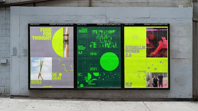
Three DE CAAI posters pasted side by side in a street hoarding, sharing a grid system but splitting across acid green, dark green and lilac.
More like this
See all
Summary
A run of three portrait posters in a black street frame, each built on the same visible grid but pitched in a different colorway, showing how one identity flexes across campaign messages.
Visual description
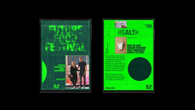
Each poster carries a thin strip of black-on-white technical copy at the top reading "OAC #1121" on the left and a permit number on the right, which reads as part of the design rather than site furniture. The left poster splits into quarters: an all-caps condensed headline "FOOD FOR THOUGHT" in dark type over lilac, a large acid-yellow circle overlapping a cropped photo of an eye, a lower photo of a hand holding green shoots against sky, and a field of scattered dots that shrink toward the corner. The "DE CAAI" logotype with its circle counter sits bottom right, with "LECTURE & WORKSHOP" and a small URL bottom left. The middle poster is dark green with "FUTURE FOOD FESTIVAL" set in a dissolving halftone-dot version of the same condensed face, two boxed dates 1916 and 2021 stacked beside a solid bright green circle, and small caps blocks reading "GROENE INCLUSIEVE STADSWIJK", "GREEN INCLUSIVE DISTRICT" and "SPACE FOR PIONEERS". The right poster inverts to a full acid-yellow field with "STEDELIJK WONEN 2.0" in dark type, two cropped photographs of people at the top right and bottom right, a dot scatter, and the logotype anchored bottom left. A faint grid of hairlines is visible on all three, and the posters sit slightly rippled in their frame against a grey painted block wall with pavement below.
Key takeaway
The system is a fixed modular grid plus three fixed ingredients: condensed all-caps type, a hard-edged circle, and a scatter of dots that acts as a gradient. Swapping only the background and accent color across the run keeps each poster distinct while the family reads instantly from across the street. The bureaucratic permit strip is absorbed into the composition instead of being fought.
Reuse notes
Good reference for a place-brand or district identity that has to speak in many voices: events, housing, food, community programming. It suits campaigns where posters will be seen in a row rather than alone. Caveat: the acid green and lilac pairing is loud and needs the dark green as a rest state, and the halftone headline treatment costs legibility at distance.