Preview image. Unlock full-res
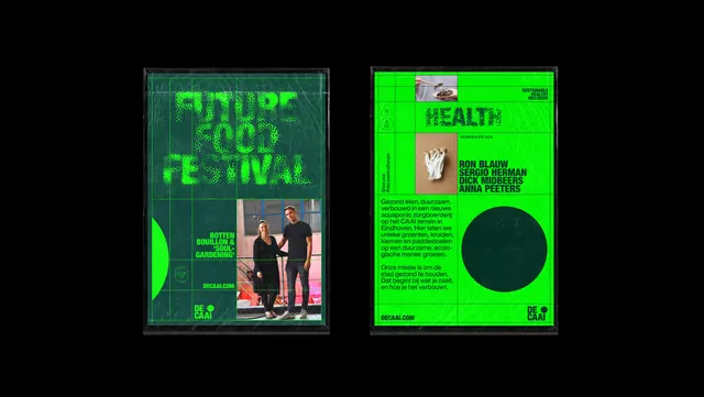
Two DE CAAI posters in clear sleeves on black, one a dissolving halftone festival title, the other a dense green information layout.
More like this
See all

Summary
Two portrait posters photographed side by side in transparent sleeves against black, contrasting a nearly illegible halftone headline with a tightly gridded information page.
Visual description
Both sheets sit flat on a pure black background with the plastic sleeves catching faint highlights. The left poster is dark green: "FUTURE FOOD FESTIVAL" runs across the top three lines in bright green condensed caps rendered as a coarse halftone dot screen, so the letters appear to be dissolving or germinating. A faint hairline grid crosses the field, a bright green circle is cropped by the left edge lower down, and a rectangular photograph of two people standing on industrial steps occupies the lower right. Small caps to its left read "BOTTEN BOUILLON & SOUL GARDENING" with a URL beneath, and the two-line logotype sits bottom right. The right poster inverts to a bright green field with dark green printing. A small food photograph and a three-line caps note sit in the top band, "HEALTH" runs large across the upper third, and a second small photograph of a cluster of mushrooms sits at the left. Beside it a stack of four names in caps is introduced by a tiny label, and below that two paragraphs of small Dutch body copy run in a narrow left column. A large solid dark green circle fills the lower right quadrant, with the URL bottom left and the logotype bottom right.
Key takeaway
The pair works as a call and response: one sheet spends everything on a single textural headline and says almost nothing, the other holds the same grid but fills it with names, copy and imagery. Rendering the headline as a dot screen turns type into a texture that echoes the identity's dot scatter, and the solid circle reappears as a deliberate empty rest area on the dense sheet.
Reuse notes
Useful for festival and programme collateral where a teaser poster and a detail poster need to ship together. The dark-on-bright and bright-on-dark inversion is an easy way to double a system without new assets. Caveat: the halftone headline is genuinely hard to read and only works when the same title appears legibly elsewhere in the campaign.
More like this
Keep what you find
A free account saves references to boards and can send you a weekly email of picks based on what you save.
To see every result, go Pro.