Preview image. Unlock full-res
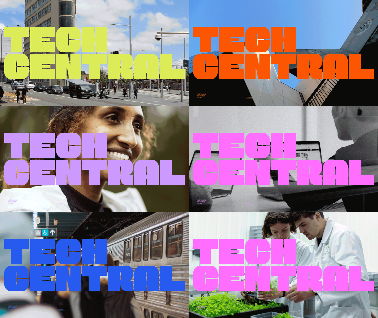
Loop that keeps a huge two line wordmark locked in place while the documentary photograph behind it and the fluorescent color of the letters change on every beat.
More like this
See all
Summary
One fixed typographic lockup, many photographs: the wordmark never moves, but its color and the image beneath it swap frame to frame to show the identity running across an entire district.
Visual description
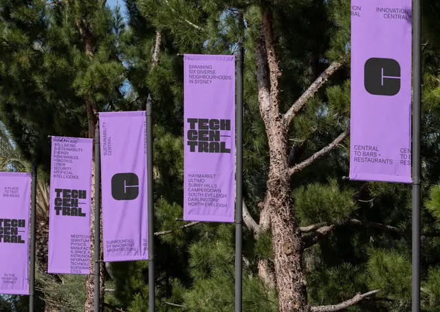
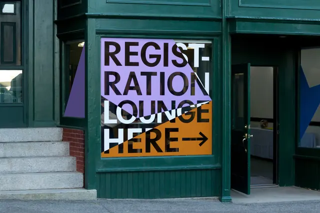
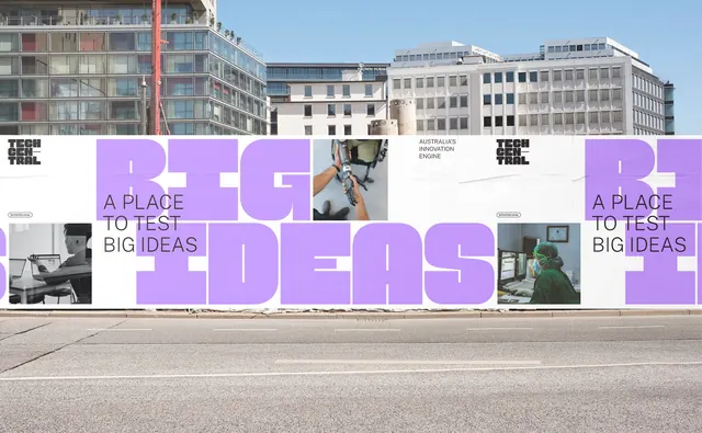
Every state is a full bleed photograph with the wordmark set across it in two stacked lines of very wide, squared off, all caps sans, sized so the letters run almost the full width of the frame and the counters are tight enough to read as slabs. The type is filled with a single fluorescent color per state, cycling through acid yellow green, spring green, orange, lilac, yellow, hot pink and electric blue, and it sits directly on the image with no plate or outline, so lighter areas of the photograph show through the letterforms slightly. The photographs are documentary in feel and consistently framed: a wide city street with tram wires and pedestrians, hands working on a drone or rig against sky, a faceted modern facade seen from below, a portrait of a smiling woman in soft light, a tower block shot upward against blue sky, a person working at a laptop in a bright office, a train at a platform, a worker pushing equipment along a street of brick buildings, and two researchers in white coats over trays of seedlings. A small block of caps sits in the lower left corner of most states and a short label in the lower right, both far smaller than the wordmark.
Key takeaway
Fixing the lockup and varying only the color and photograph is what makes a place brand feel like one system across wildly different subjects. Letting the fluorescent fill sit straight on the image, with no drop shadow or containing box, is the move that keeps it feeling contemporary rather than like a caption.
Reuse notes
Reach for this when a brand covers many activities and needs a single unmistakable frame device, such as a precinct, a festival or a university campus. Needs a disciplined photography library shot at consistent exposure, and a type color bright enough to hold against any of it. The type will lose legibility over busy or high key images, so pick photographs with a calm band where the letters land.
More like this

Keep what you find
A free account saves references to boards and can send you a weekly email of picks based on what you save.
To see every result, go Pro.