Preview image. Unlock full-res
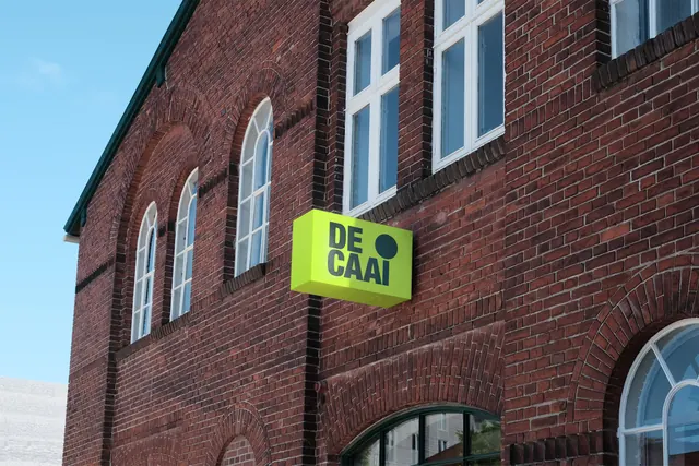
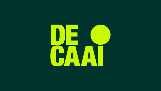
The DE CAAI logotype presented large in acid green on a deep bottle-green field, with a filled circle standing in for the dot of the I.
More like this
See all

Summary
The primary logotype shown alone: two stacked lines of heavy condensed caps in acid green on dark green, with an oversized filled circle replacing the dot of the I.
Visual description
The frame is a flat deep bottle-green field, roughly 16:9, with the mark centered and occupying about a third of the width. "DE" sits on the upper line and "CAAI" on the lower, both in a very heavy grotesque with squared terminals, near-zero tracking and letters that almost touch. The lower word is wider than the upper, so the block reads as a left-aligned mass with a stepped right edge. Into the gap at the top right, where "DE" ends, sits a large solid circle in the same acid green, aligned to the cap height of the top line and reading as the tittle for the I directly below it. There is no other element, no tagline, no rule and no texture. The color contrast is extreme: a highly saturated yellow-green against a dark, slightly desaturated green.
Key takeaway
The circle does double duty as a punctuation mark and as a standalone brand device, which is why the same dot can be blown up into a graphic element elsewhere in the system. Stacking the two words to different widths creates a deliberate negative-space notch, and the circle fills exactly that notch rather than sitting beside the type.
Reuse notes
Useful when a wordmark needs a detachable symbol without drawing a separate icon. Works for place brands, districts and cultural venues where the mark will appear huge on banners and tiny on stationery. Caveat: the acid-on-dark pairing is the only reason the mark reads this hard, so it needs a defined inverse treatment before it can go on light or photographic backgrounds.