Preview image. Unlock full-res
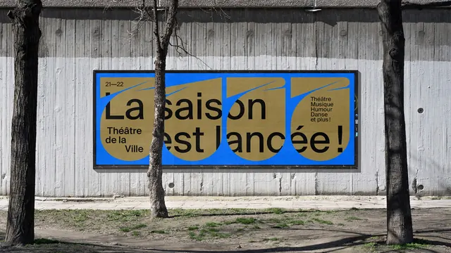
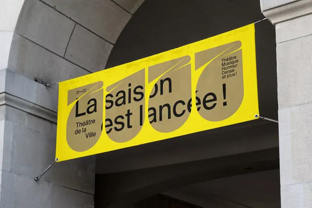
A horizontal billboard on a concrete wall where four khaki teardrop counters on bright blue hold the season launch headline in black lowercase sans.
More like this
See all

Summary
A wide format season poster that repeats the identity's teardrop counter four times across bright blue, using the shapes as a typographic rhythm rather than as decoration.
Visual description
A landscape billboard in a slim black frame is mounted on a board-marked concrete wall, with three bare tree trunks in front of it and patchy grass below. The poster field is a saturated mid blue. Four large khaki teardrop shapes sit side by side across the full width, each with a thin blue spike curving out of its upper right, so the row reads almost as four letterforms. Black lowercase type is laid over the top: 21-22 as a small line in the upper left, then La saison in large type across the upper middle, and est lancée! in the same size across the lower middle, with the words breaking over the shape boundaries. Small stacked type in the lower left gives Théâtre de la Ville over three lines, and at the right a four-line list reads Théâtre, Musique, Humour, Danse et plus!. The paper shows slight seams where it was pasted up and the tree trunks obscure parts of the words.
Key takeaway
Repeating a single brand shape four times converts an empty wide format into a composition with its own metre, and setting the headline across the shape seams ties type and shape into one layer. The blue and khaki pairing is unusual enough to be recognisable at distance without any logo.
Reuse notes
Suited to wide, low outdoor formats where a centred lockup would drown. The approach assumes a shape distinctive enough to survive repetition; a generic circle would read as pattern rather than as identity. Allow for real-world obstructions like posts and trees when placing the smaller information blocks.