Preview image. Unlock full-res
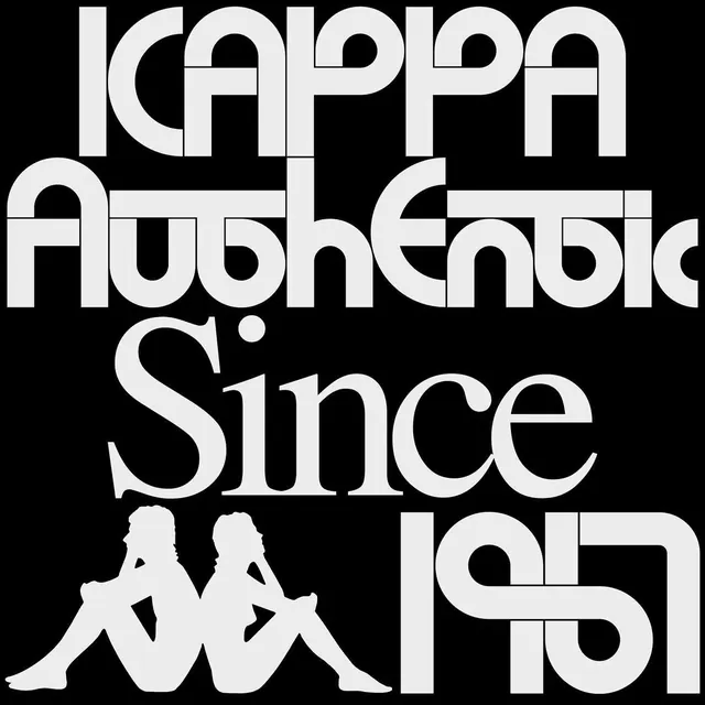
Bold black and white logo graphic with large display typography for "Kappa Authentic Since 1978" and two seated silhouette figures integrated into the lettering.
Summary
Square black background brand graphic with oversized white condensed sans typography spelling "KAPPA Authentic Since 1978" and integrated white silhouettes of two figures.
Visual description
Solid black field. Top two lines large white all-caps "KAPPA" and "Authentic" with distinctive cutout letterforms. Below "Since" in flowing script-like weight, "1978" stylized with extended forms. Bottom left two white silhouettes of seated figures forming part of the "AA" motif, one with leg extended. High contrast, tight letter spacing, retro athletic branding style.
Key takeaway
Integrating figurative silhouettes directly into the letterforms and date creates a memorable, ownable wordmark lockup that is both graphic and narrative.
Reuse notes
Reference for bold logo designs, sportswear or lifestyle brands wanting strong typographic presence with minimal color. The silhouette integration is a reusable device for storytelling in marks. Works best at large scale.