Preview image. Unlock full-res
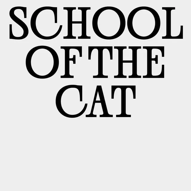
Three-line stacked wordmark in a bold, high-contrast serif face on a light gray ground.
Summary
Stacked three-line wordmark using a bold serif display face in black on a light gray ground, emphasizing typographic authority and institutional credibility.
Visual description
Three lines of uppercase serif text stacked vertically and centered: SCHOOL, OF THE, CAT. The typeface is a substantial, high-contrast serif (likely a transitional or modern serif) with generous letter spacing and generous line-height. Black characters sit against a soft gray background, creating stark contrast. The composition is rigorously centered and symmetrical, with ample white space below the type.
Key takeaway
Serifs paired with all-caps composition and centered stacking create immediate institutional weight. The generous spacing around the letters and lines breathes without losing boldness. High-contrast against a neutral tone (rather than pure white) softens the severity.
Reuse notes
Strong baseline for educational, academic, literary, or formal institutional brands. Works well for schools, museums, law firms, think tanks. The serif choice and spacing pattern work equally well at small sizes or large displays. Avoid when targeting younger or casual audiences.