Preview image. Unlock full-res
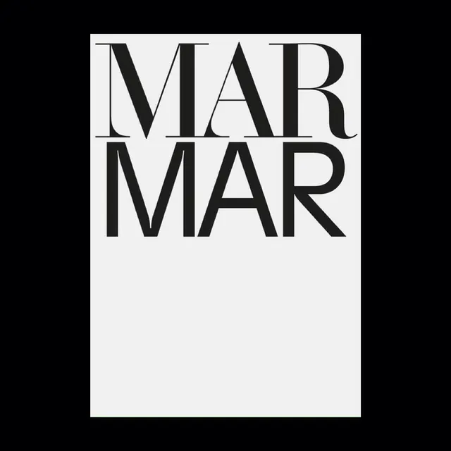
A stark, stacked typographic mark repeating "MAR" twice in black serif letters on a white background.
Summary
A minimal, high-contrast typographic identity using the word "MAR" repeated twice in a classic black serif typeface on a pure white background.
Visual description
Two rows of "MAR" stacked vertically, rendered in a traditional serif font with strong strokes. The letters are tightly spaced and rest on a clean white background with generous negative space below. The extreme contrast between black letterforms and white space creates an architectural, deliberate effect.
Key takeaway
The power of pure contrast and repetition. Using a single serif typeface in black and white, with thoughtful spacing and stacking, creates a mark that feels both timeless and modern.
Reuse notes
Strong choice for a minimalist identity or as a headline treatment in editorial layouts. The classical serif feels appropriate for luxury, culture, or heritage brands. The stark black-and-white palette works equally well on dark or light backgrounds when applied to other elements.