
Preview image. Unlock full-res
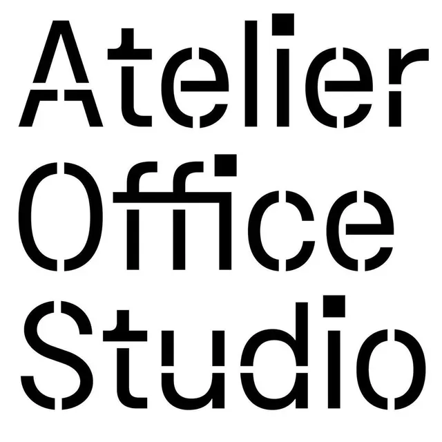
Geometric sans-serif wordmark with organic apertures and modulated stroke weight, set on white background.
Summary
Geometric sans-serif wordmark with organic apertures and modulated stroke weight, set on white background.
Visual description
Black sans-serif wordmark (nine letters) on white background, centered and set in a geometric typeface with open, rounded apertures that soften the grid-like letter construction. The letterforms balance geometric precision (consistent stem widths, squared terminals) with organic counter shapes (circular bowls, curved junctions). Uniform weight throughout; generous letter spacing. The typeface has humanist undertones despite its geometric roots, making it both technical and approachable.
Key takeaway
Apertures and counters are the key: open, generous spaces inside letters create rhythm and breathing room, preventing the design from feeling rigid or cold. The mix of hard geometry and soft curves prevents the wordmark from reading as sterile. This approach bridges corporate credibility with contemporary warmth.
Reuse notes
Ideal for consulting, creative services, tech, or design brands that need to signal precision without sacrificing personality. Works well on dark or light backgrounds. The open letterforms favor larger display sizes and resist legibility issues in smaller applications.
More like this








Keep what you find
A free account saves references to boards and can send you a weekly email of picks based on what you save.
To see every result, go Pro.