Preview image. Unlock full-res
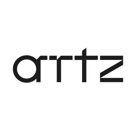
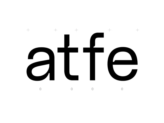
Typeface specimen for Arttz, a minimalist geometric sans-serif with modular letterforms designed for contemporary branding applications.
Summary
A geometric sans-serif typeface where each letterform is constructed from precise, modular strokes with consistent weight, creating a unique wordmark for contemporary design contexts.
Visual description
The word "ARTTZ" appears in a custom sans-serif display font on white background with black letterforms. Each letter uses simplified geometric construction: the A is built from angled strokes forming a triangular negative space; R combines a circular counter with linear stems; T is two horizontal rectangles stacked; and Z is a diagonal stripe system. All letterforms maintain uniform stroke weight and align to an invisible grid, emphasizing modular construction.
Key takeaway
How uniform stroke weight and geometric simplification can create distinctive wordmarks without ornamentation. The approach of treating each letter as a system of rectangles and circles rather than organic curves. The high legibility achieved through extreme restraint and spacing precision.
Reuse notes
Effective for tech, design, or architecture brands needing to project precision and modernity. The geometric approach reads cool and intellectual rather than warm. Works particularly well as a display face for headlines, logos, and signage; smaller sizes require generous letterspacing to maintain clarity.
More like this





Keep what you find
A free account saves references to boards and can send you a weekly email of picks based on what you save.
To see every result, go Pro.