Preview image. Unlock full-res
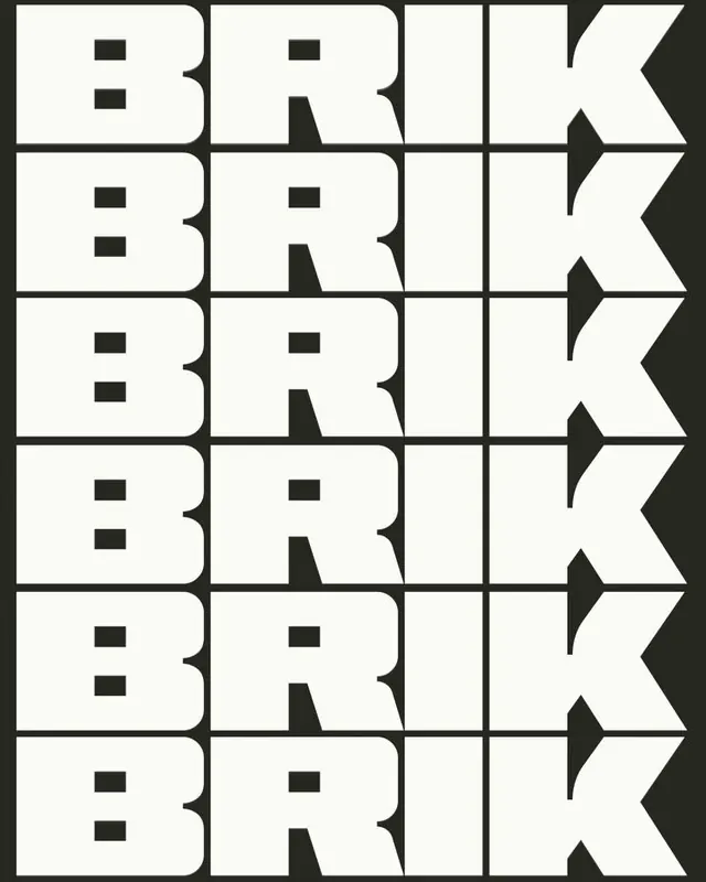
A typographic poster displaying BRICK repeated in a 6x1 grid with thick geometric sans-serif letters carved into modular compartments.
Summary
A brutalist typographic poster displaying BRICK in thick, geometric sans-serif letters arranged in a 6x1 grid with white letterforms on charcoal background.
Visual description
Six rows of the word BRICK fill the composition, each row separated by thin horizontal lines. Each letter is cast in a thick, geometric sans-serif with uniform stroke weight and sharp corners. The letterforms are carved into modular compartments: each letter sits within a white rectangular cell with dark borders, creating a tightly structured grid. Interior details within letters like the negative spaces in B and R are revealed as small black rectangles. The overall palette is stark black and white with high contrast, evoking industrial architecture and constructivist design.
Key takeaway
The modular cell system creates rhythm and structure while keeping type legible at display size. Using interior negative space as design element (the rectangular apertures in B, R) adds sophistication and industrial character. Repetition of a single word in a perfect grid creates both pattern and emphasis without decoration.
Reuse notes
Ideal for design systems, architectural branding, or institutional work seeking authority and rigor. The geometric construction works at large scale as a poster or installation. Not suited for body text due to extreme formality; best reserved for headlines, identity marks, or immersive typographic environments. Consider the brutalist mood carefully against brand warmth.
More like this




Keep what you find
A free account saves references to boards and can send you a weekly email of picks based on what you save.
To see every result, go Pro.