Preview image. Unlock full-res
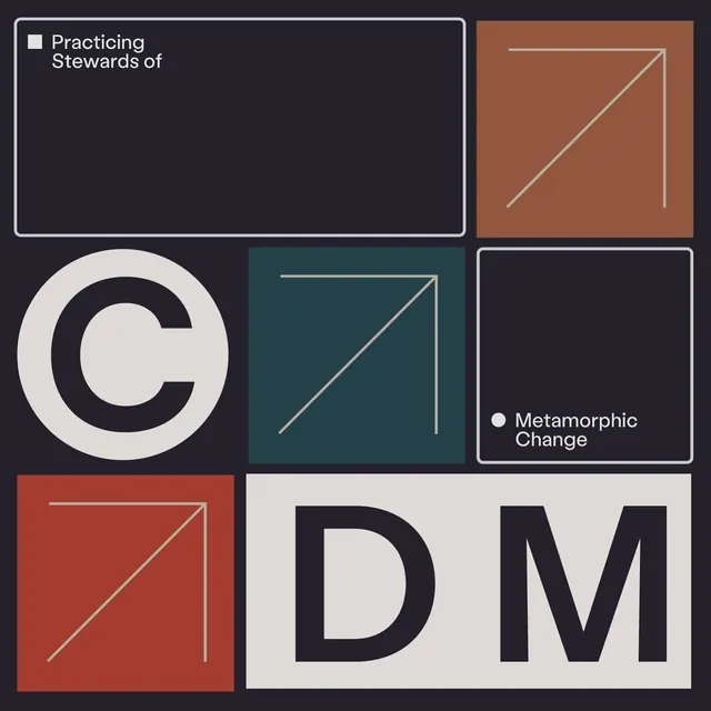
Nonprofit identity system pairing a bold circular C-mark with modular diagonal-line patterns across dark navy, terracotta, teal, and off-white color blocks.
Summary
A multi-panel corporate identity for a nonprofit, centered on a bold, open circular C-mark paired with repeating diagonal-line motifs across color-blocked panels.
Visual description
Six asymmetric rectangular panels arranged in an informal grid. Top left: dark navy panel with the C-mark and "Practicing Stewards of" in white sans-serif. Top right: terracotta panel with two diagonal white lines forming a corner bracket. Middle left: oversized cream-and-navy C-mark. Middle center: teal panel with diagonal lines. Middle right: dark navy panel framing "Metamorphic Change" text with a small cream dot. Bottom: a cream panel divided into two sections, one burnt-red with diagonal lines, the other displaying large bold "DM" letters in navy sans-serif. The palette is restrained and earthy: navy, cream, terracotta, teal, burnt red. The diagonal-line motif recurs as an abstract pattern tying the panels together.
Key takeaway
The modular, repeating diagonal pattern as a flexible system element. The color blocking creates immediate visual weight while the geometric lines add graphic interest without decoration. The oversized single-letter mark is a strong, memorable mnemonic across all panel combinations.
Reuse notes
Strong for nonprofits, educational institutions, and professional services seeking a mature, structured identity. The diagonal pattern works well as a secondary pattern in collateral (cards, letterhead, report covers). The restrained color palette reads as trustworthy and analytical without being corporate-sterile.
More like this







Keep what you find
A free account saves references to boards and can send you a weekly email of picks based on what you save.
To see every result, go Pro.