Preview image. Unlock full-res
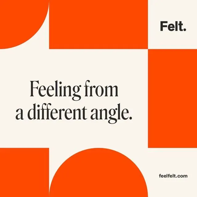
Felt brand poster with bold orange geometric blocks and a serif headline on off-white, declaring 'Feeling from a different angle' with a small domain URL at bottom right.
Summary
Felt brand poster composed of bold orange and off-white geometric blocks with a serif headline stating "Feeling from a different angle" and a small domain URL bottom right.
Visual description
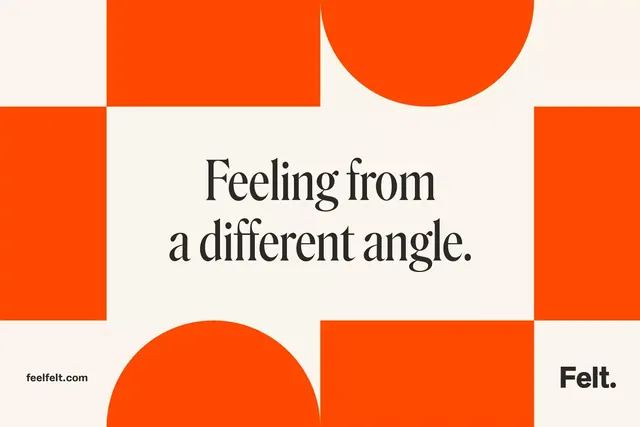
An asymmetric grid of large geometric blocks fills the composition: bright vibrant orange (#FF4900) rectangles and organic curved shapes are arranged against an off-white background, creating high-contrast visual tension. A serif headline in dark grey/charcoal ("Feeling from a different angle") spans the center-left in a generous, sophisticated typeface. A small "feltfelt.com" URL appears in the lower right corner. One large orange curved shape sits top-left, others are stacked vertically and horizontally throughout. The overall effect is modern, confident, and deliberately playful without whimsy.
Key takeaway
The fearless use of large, simple color blocks to create rhythm and movement. The serif headline choice adds sophistication to what could be purely geometric coldness. The asymmetry and organic curves within the grid keep it from feeling rigid. Small URL in the corner grounds the brand subtly without dominating.
Reuse notes
Ideal for brands seeking a bold, modern, confident positioning. Works across print and digital. The orange/white contrast is high-energy; tone down the saturation or pick different complementary colors if you need it calmer. The serif serif-on-modern approach works best when the typeface is confident and generous with scale.
More like this




Keep what you find
A free account saves references to boards and can send you a weekly email of picks based on what you save.
To see every result, go Pro.