Preview image. Unlock full-res
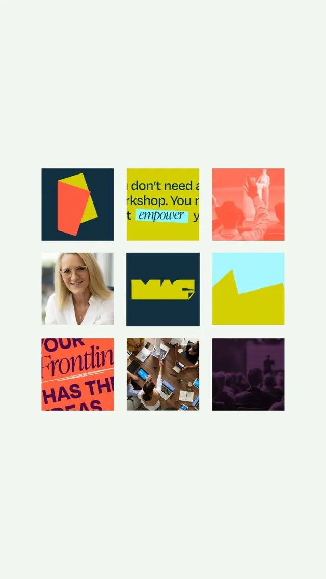
Nine-panel editorial grid mixing bold typographic layouts, geometric shapes, photography, and vibrant color blocking across bright yellow, coral, navy, and neutrals.
Summary
A 3x3 modular grid of editorial panels mixing bold sans-serif typography, geometric color shapes, live photography, and bright single-color backgrounds (yellow, coral, navy) with contrasting black and white text.
Visual description
Nine equal square panels arranged in a 3x3 grid on a light beige background. Top row: (left) navy square with a geometric coral and yellow rotated polygon; (center) bright yellow panel with bold black text reading "don't need a workshop" overlaid with italicized blue "empower" underlay; (right) coral photograph with faint white female silhouette. Middle row: (left) candid portrait of a woman in neutral tones; (center) navy square with a bold yellow geometric logo mark; (right) light cyan panel with a geometric yellow hill or wave shape. Bottom row: (left) bright coral background with bold blue text "OUR Frontlin" and partial word "HAS TH"; (center) flat-lay overhead shot of packaging and products; (right) purple ambient photograph of a crowd. The typography throughout is heavy, confident sans-serif. Color contrast is maximized: warm bright hues against cool navy and white, black against yellow, creating visual punch and urgency.
Key takeaway
The mix of different content types (type-only, photography, geometric color shapes) unified by a rigid grid. The boldness of color blocking without gradients or subtle transitions. The use of high-saturation single colors as backgrounds to float other elements. Typography set so large it bleeds or crops to emphasize impact.
Reuse notes
Effective for marketing, social content, or editorial work where you need to pack multiple messages into a cohesive visual system. The grid makes it feel organized despite the visual cacophony. Scale varies without breaking unity because the grid is the anchor. Works well for brand asset showcases, capability grids, or multi-audience editorial layouts.
More like this
Keep what you find
A free account saves references to boards and can send you a weekly email of picks based on what you save.
To see every result, go Pro.