Preview image. Unlock full-res
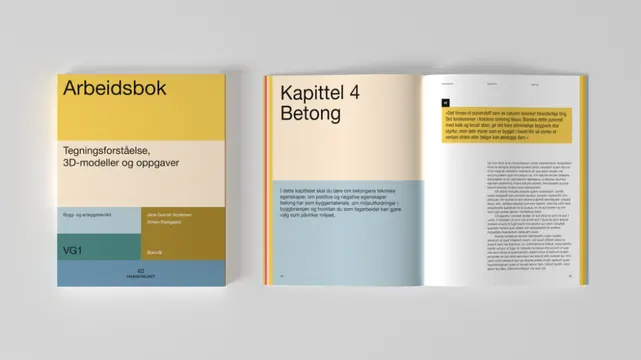
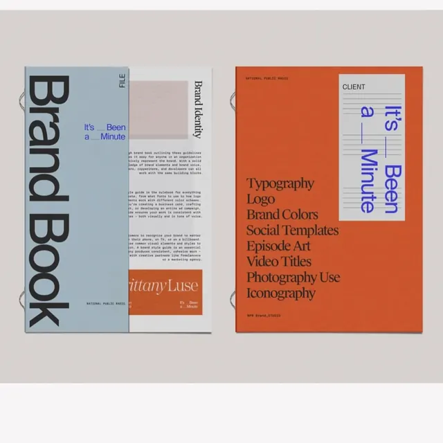
Three-page branding manual spread showcasing structured layout, warm color blocking, and clear typographic hierarchy for educational or institutional branding.
Summary
Three-page branding manual spread showcasing structured layout, warm color blocking, and clear typographic hierarchy for educational or institutional branding.
Visual description
Left page shows a cover design with "Arbeitsbuch" title and a horizontal color block (mustard yellow transitioning to muted blue-green) with white space below. Center and right pages display interior content: the left interior page features a grid-based layout with a large mustard-yellow header bar, subheadings, body text, and a small color palette swatch. The right page continues the structured approach with more text blocks and organized information. Color palette uses warm earth tones (mustard, beige, gray-white) and cooler accents. Sans-serif typeface throughout emphasizes legibility and institutional character.
Key takeaway
The restrained color palette (two or three strategic accent colors against neutral/light grounds) solves the institutional-authority problem without coldness. The horizontal color block as a visual anchor appears on every page without being repetitive. The grid structure is invisible but makes page scanning effortless, perfect for manuals and guidelines.
Reuse notes
Strong model for educational institutions, nonprofits, and formal corporate identity systems. The mustard-and-gray combo is period-current and warm enough to feel approachable. Scale the concept to digital: the horizontal color bar translates to headers, dividers, or sidebar accents. Works best when information density is moderate.
More like this

Keep what you find
A free account saves references to boards and can send you a weekly email of picks based on what you save.
To see every result, go Pro.