Preview image. Unlock full-res
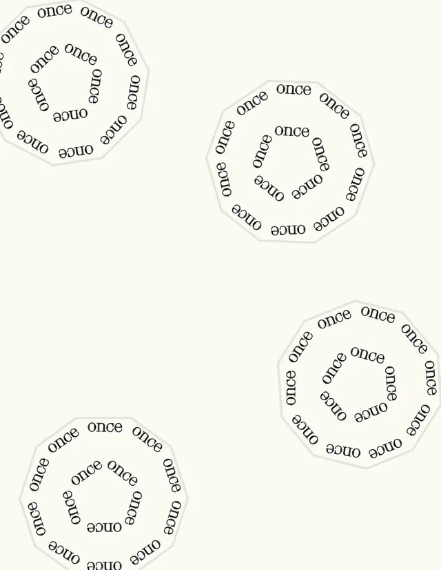
Four circular stamp-like marks built from the word 'once' repeated around the perimeter in a rotating sans-serif pattern.
Summary
Four circular stamp-like marks, each built from the word "once" repeated radially in a rotating sans-serif typeface at different scales, on a cream background.
Visual description
Four circular logos arranged in a loose scatter on a warm off-white background. Each is a closed circle outlined with a thin gray-brown stroke, filled with the word "once" typed repeatedly around the perimeter in a clockwise spiral. The text rotates with each repetition, creating a radial calligram effect. The typeface is a simple, clean sans-serif in dark brown, rendered at slightly varying sizes and angles to suggest a hand-stamped, methodical quality. The circles range in diameter from roughly 200px to 250px. No additional imagery or color variation; the design relies entirely on the constraint and repetition of text as its primary visual grammar.
Key takeaway
The use of rotational text symmetry to create a logo mark with zero extra imagery. The stamped, imperfect feel comes from subtle kerning variation and angle shifts, not a designed texture. The economy of means: one word, one typeface, one stroke color, infinite compositional depth.
Reuse notes
Strong reference for minimal, conceptual branding or logotype work emphasizing constraint and repetition. Reads as playful yet deliberate. Suitable for studios, type-focused brands, or documentation/taxonomy systems that value methodical presentation.